IBM: Success 360
Designing an internal unified dashboard for IBM offering managers — replacing a fragmented web of tools with a single, intelligent platform for managing SaaS offerings at scale.
Overview
Success 360 was an internal IBM project to improve and optimize how IBM offering managers could oversee the SaaS offerings they manage and locate key information across the portfolio.
The problem: offering managers had no unified platform to view the multiple SaaS offerings they ran or search other active offerings. They relied on a fragmented mix of different programs and outdated links to track performance. They also had no way to identify who worked within other offerings — critical when needing to connect with counterparts developing similar products.

IBM Success 360 — a unified offering management platform.
Research
I worked as the sole UX designer under the guidance of a project manager. At the start of the project I conducted user research by setting up interviews with 11 different offering managers across 4 IBM business units, preparing a detailed interview script to surface daily pain points.
The findings were stark. Managers described little to no data insight, lack of agility, limited access to information, and communication issues at scale. Hours were lost each week searching for email contacts, trawling wikis for information, and switching between management platforms. Analytics tracking was particularly painful — managers were frequently left in the dark about how their own SaaS products were performing.
One manager told us: "Our offering has no built-in analytics so I can't see details about our products. I need to know the people and key figures to communicate with to get this information as it is spread around."
Using the interview research I built an empathy map covering what offering managers say, think, do, and feel. From this I developed a consolidated offering manager persona and a clear set of design goals for the tool.
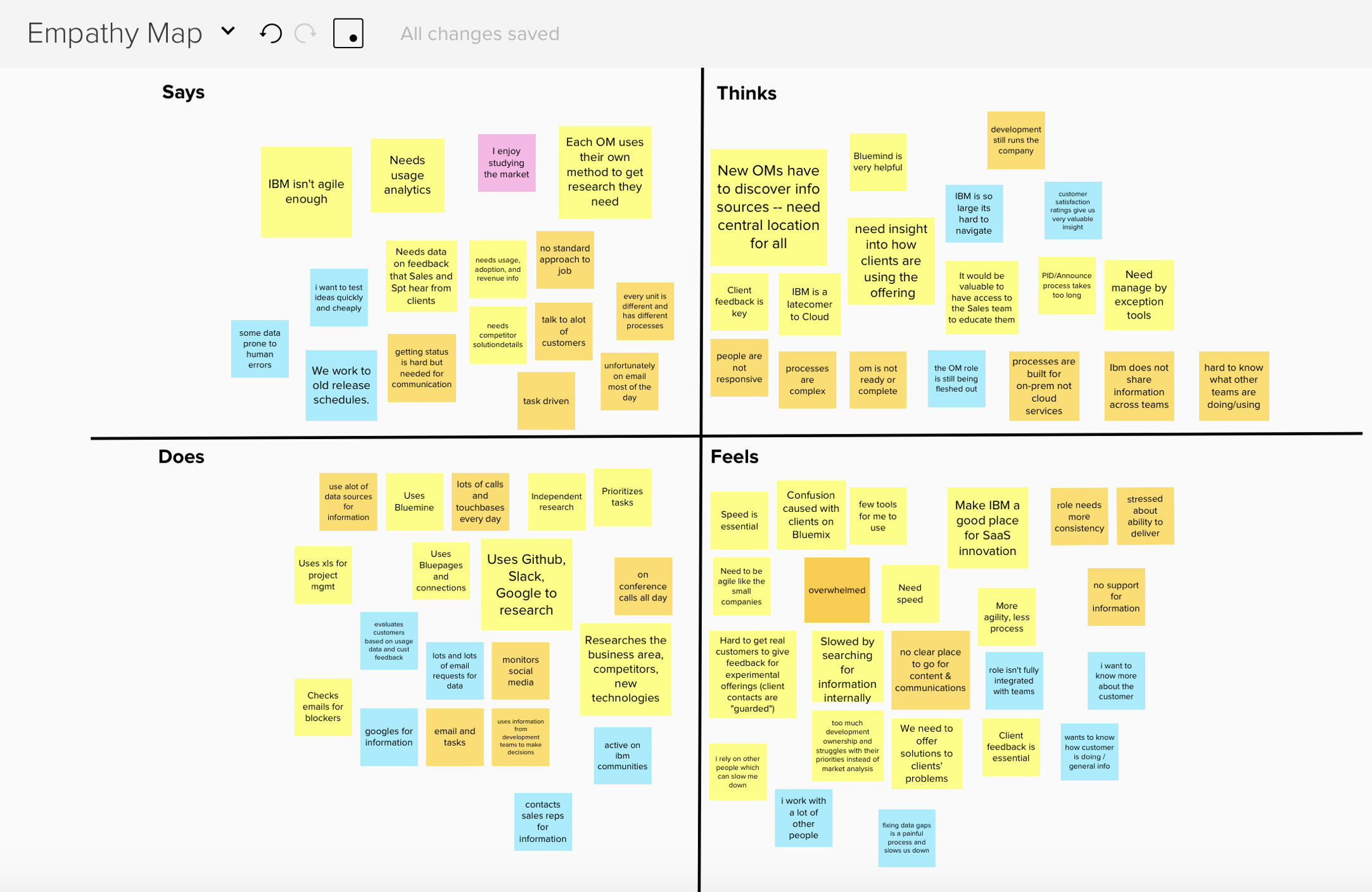
Empathy maps built from user interviews.
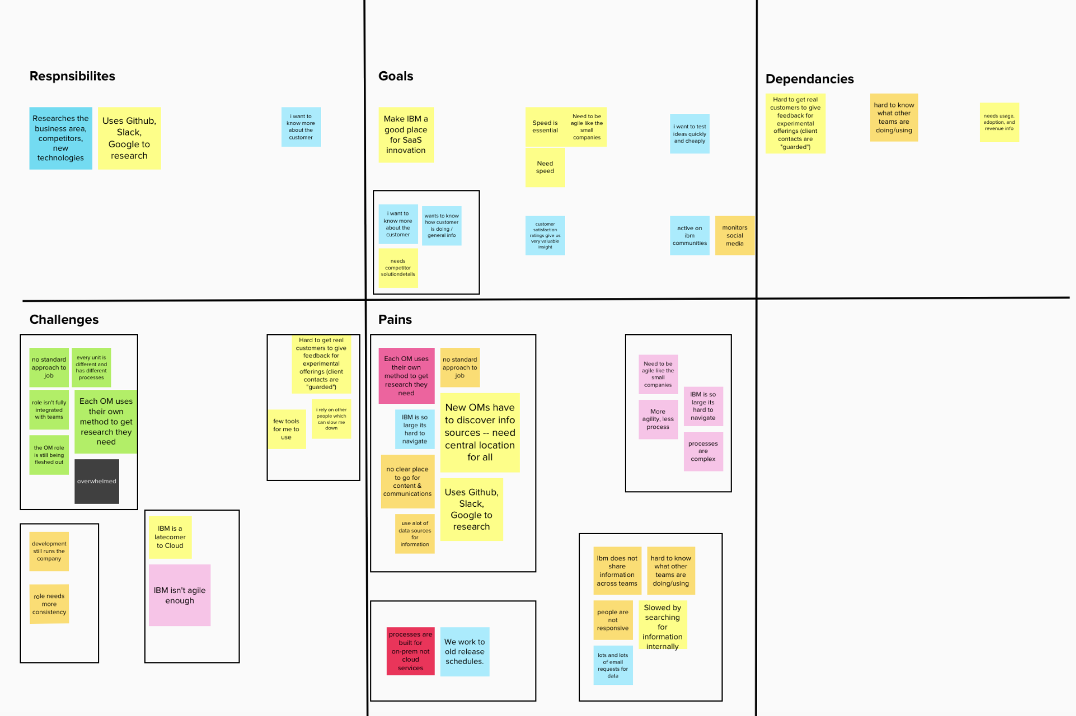
Key themes and pain points surfaced through research.
Sketching & Wireframing
I synthesized research into four core requirements. The dashboard needed to: let managers quickly view the status of their offerings; provide in-depth data and historical metrics; support a single unified account across multiple offerings; and enable search across users and SaaS offerings.
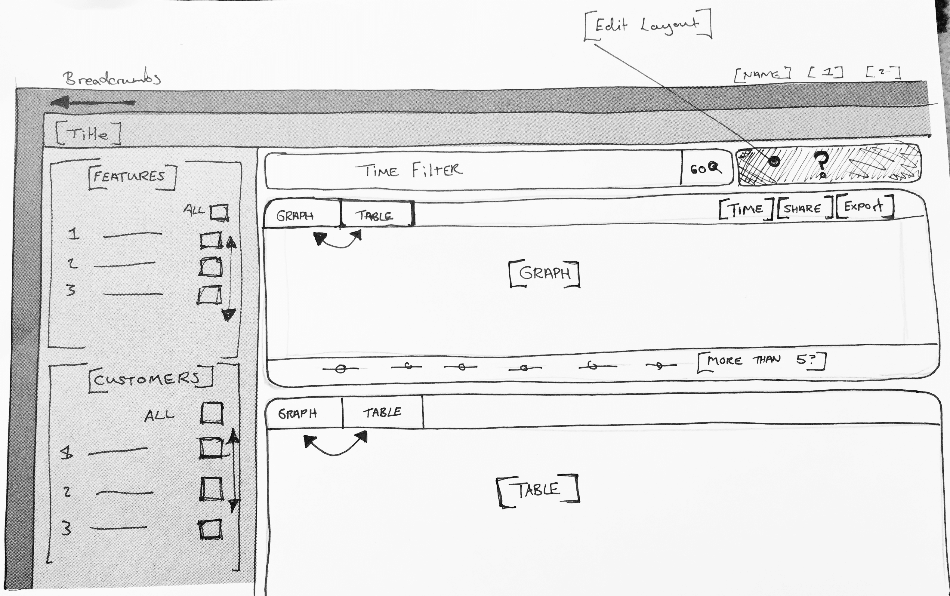
The first design problem I focused on was the 'Overall Health' system — an at-a-glance module that could give managers a quick overview of an offering's performance using key metrics like usage, recurring revenue, and active support tickets. This would let managers quickly gauge and prioritize where to focus their attention.
For the main dashboard, I settled on a card-style layout where an overview of each data point could be displayed neatly side-by-side. The card approach also enabled user personalization — managers could customize their dashboard to surface what mattered most to them, and select any card to drill into detailed data.
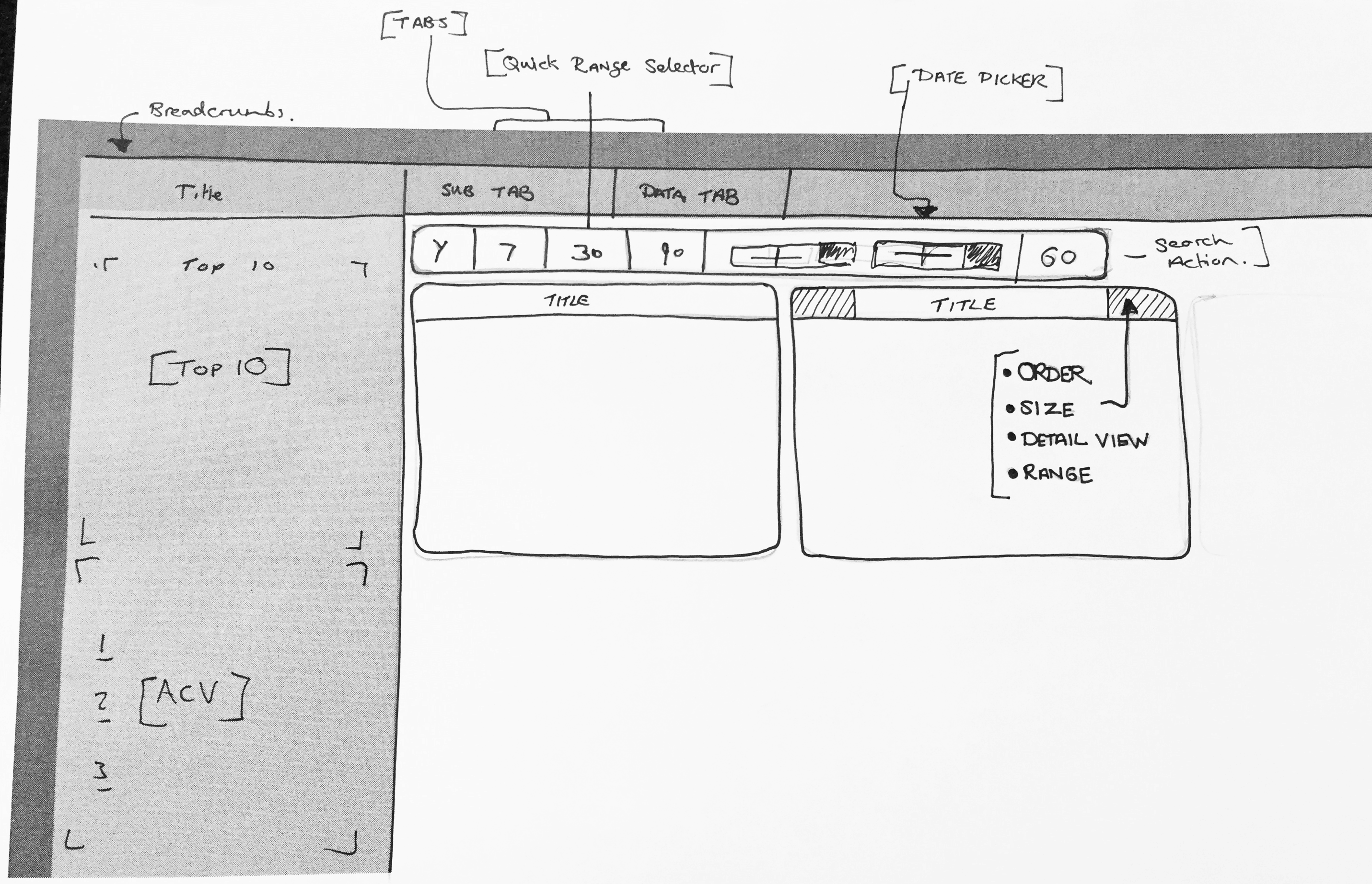
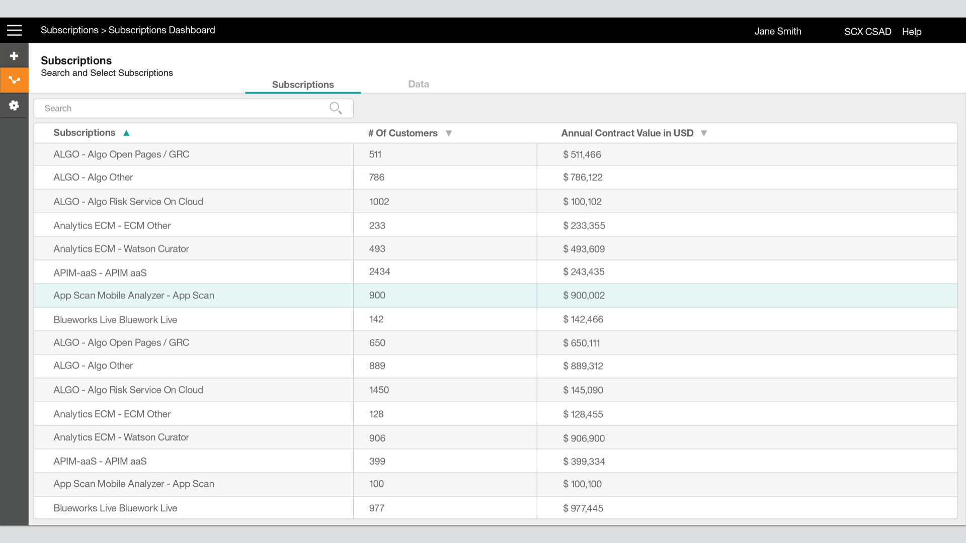
Finally, I designed a comprehensive search system for filtering through thousands of offerings. The main challenge was fitting all relevant offering information into the results table — I iterated through multiple layouts and incorporated iconography to convey complex information without overwhelming users.
Initial wireframes were validated through InVision click-through prototype testing with offering managers. Feedback was extremely positive and validated the 'Overall Health' concept, while also driving refinements to the search table layout.
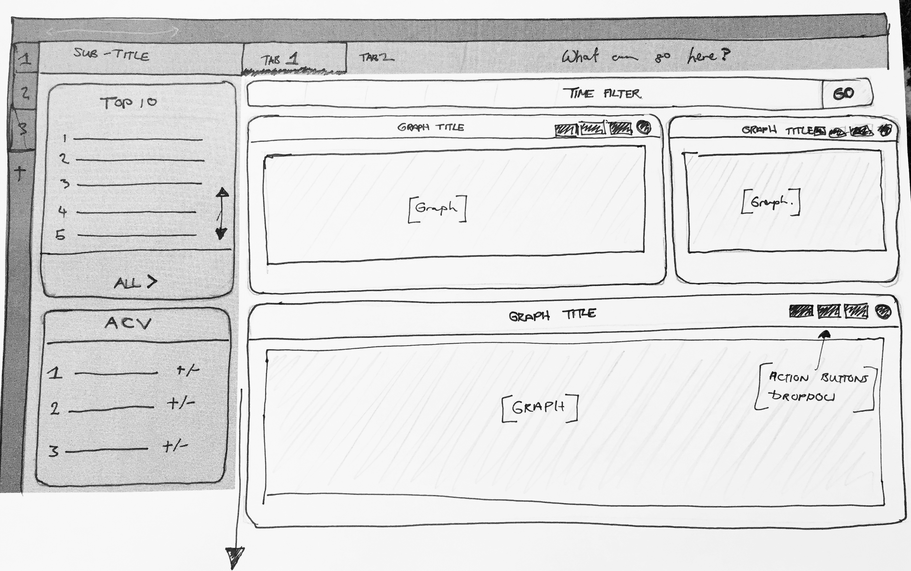
Early sketches for the Success 360 dashboard.
Sketching the Overall Health module and card layout.
Sketching the offering search and filter system.
Final Designs
After testing and refining the wireframes I met with the internal development team to begin implementation. As the sole designer on the project I handled visual design myself — a new challenge that pushed me to grow. The feedback from offering managers was overwhelmingly positive; having dealt with these pain points for years, they found immediate value in the tool.
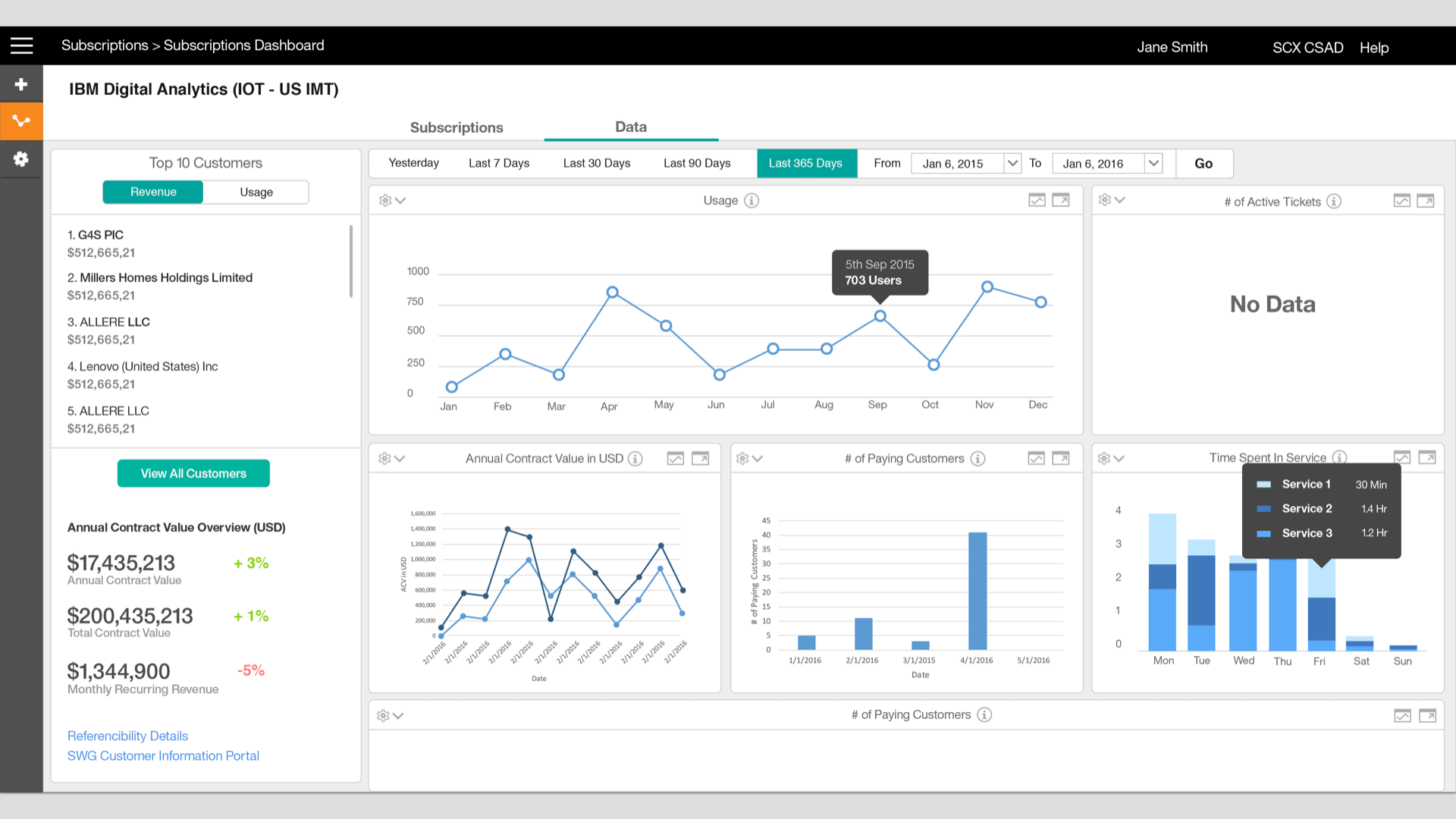
Success 360 — main dashboard overview.
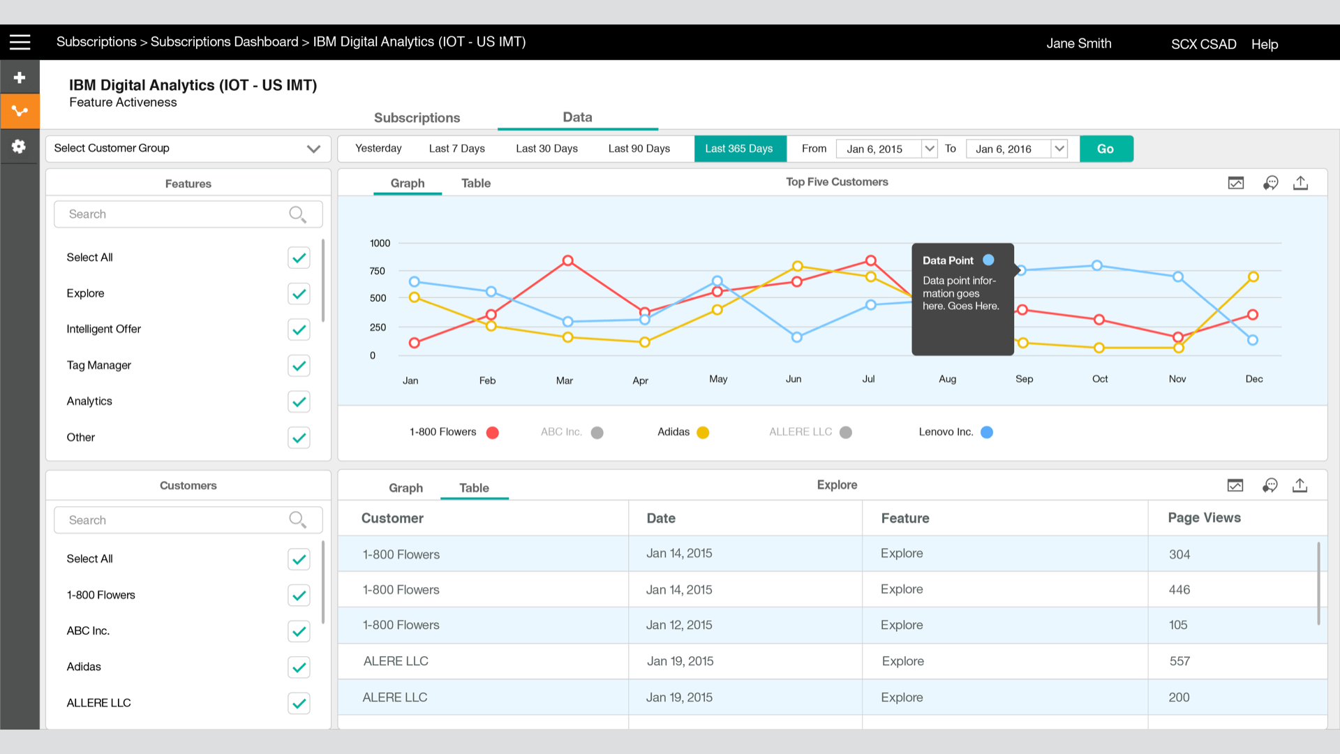
Offering detail view with health metrics.
Customizable data card layout.
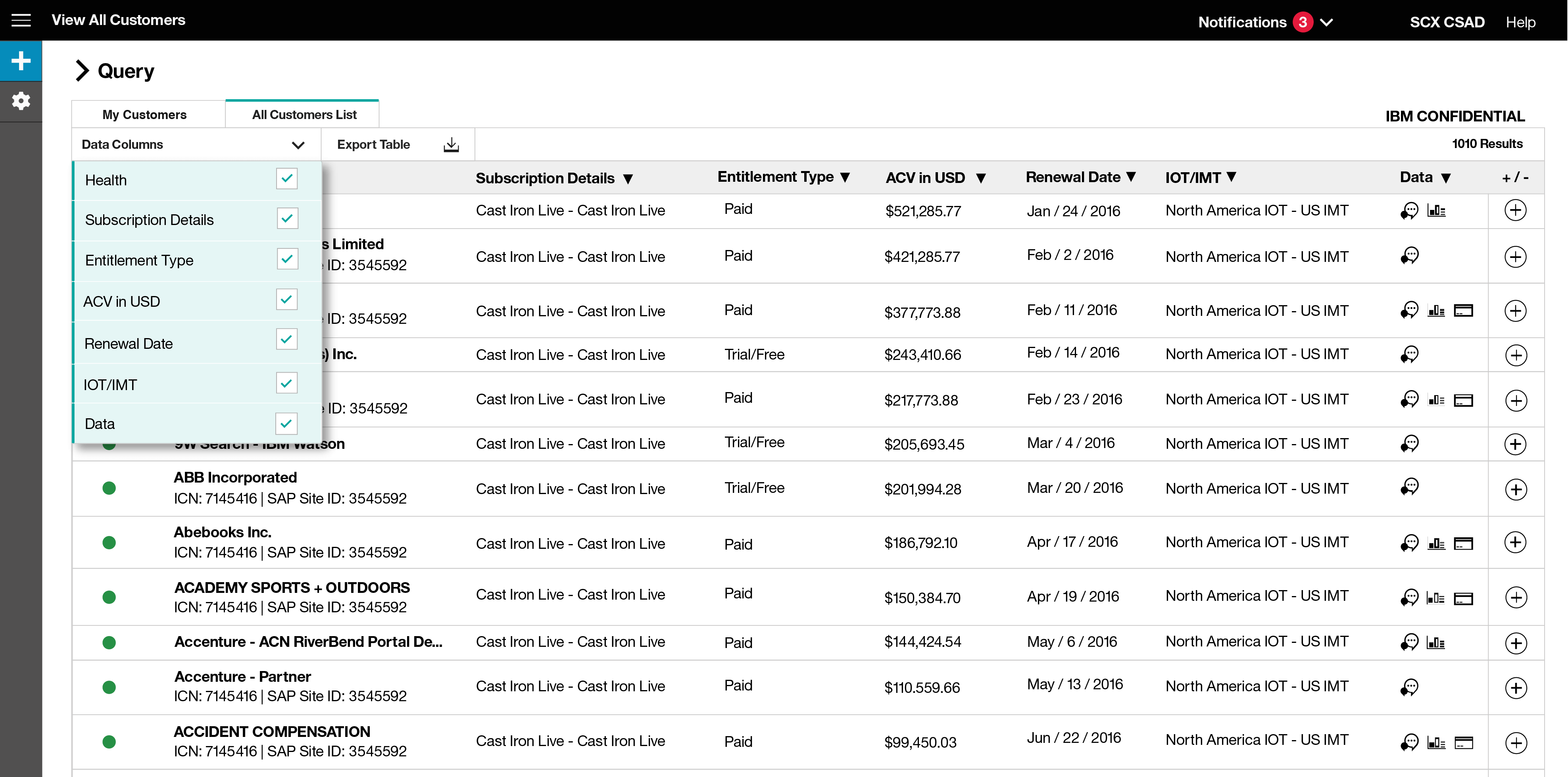
Offering search and results table.
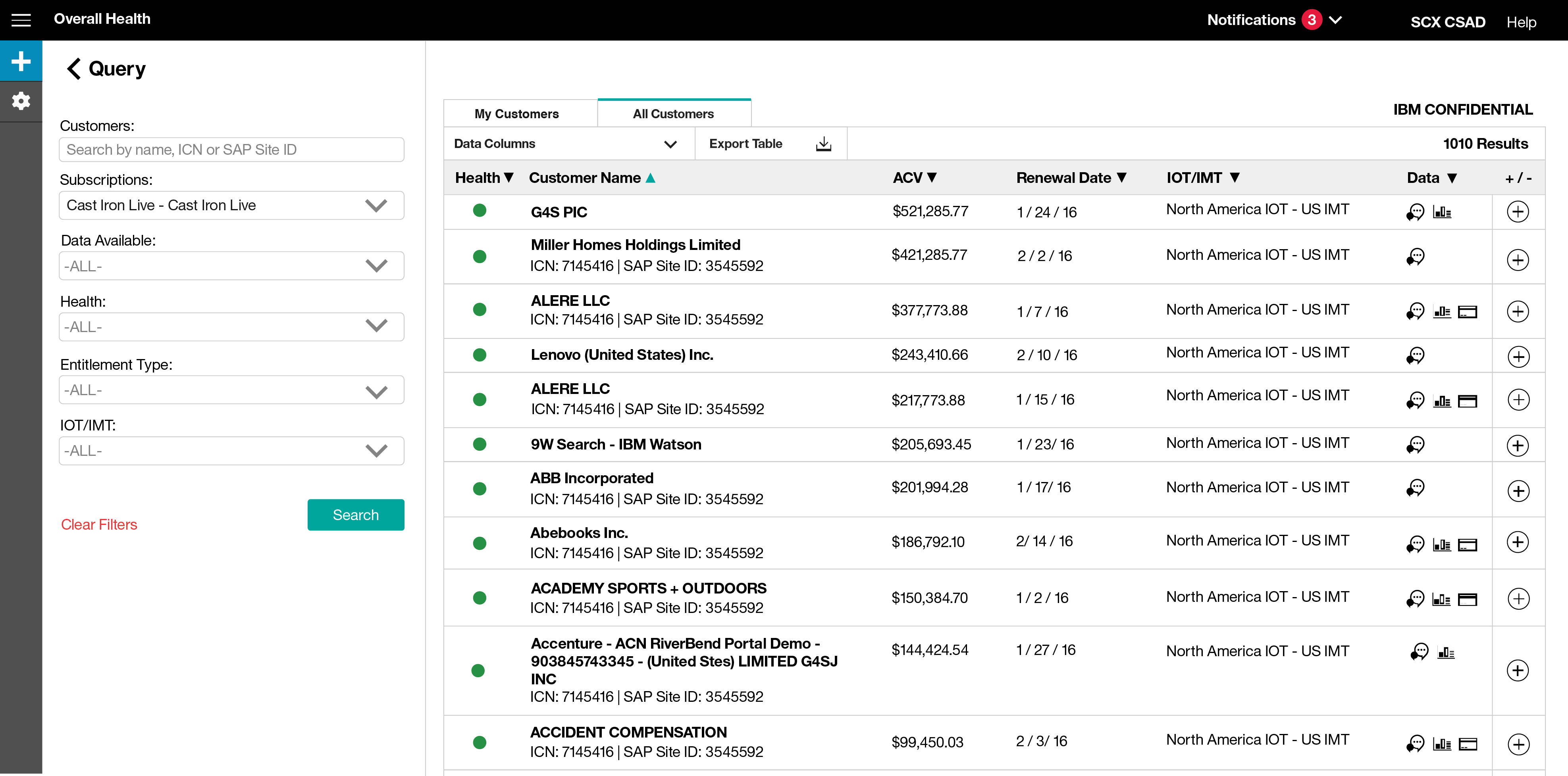
Filtered search results with offering detail.