Fruit of the Loom
A full eCommerce redesign for one of America's most iconic apparel brands — modernizing the shopping experience to connect with a younger generation of customers.
Overview
In 2018 I worked as part of a team to fully redesign the Fruit of the Loom eCommerce site. Our challenge was to modernize the site and create a fresh digital shopping experience that would connect with younger customers and provide a platform for Fruit of the Loom to grow their brand in the future.
Fruit of the Loom eCommerce redesign.
Ideation & Kickoff
At the start of the project, the team flew to Bowling Green, KY to meet with Fruit's leadership. We conducted a kickoff and requirements-gathering workshop, and as the primary UX designer I hosted a collaborative UX workshop with the Fruit team — whiteboarding and sketching to discuss their vision, desired functionality, and beneficial modules.
In turn, Fruit shared their extremely in-depth customer analytics and research conducted over the past few years. The meeting was a huge success — we learned a lot about Fruit's brand and core values, and gained deep insights into the customer personas they had developed.
Research & Crafting Personas
During the research phase, the team conducted competitive analysis on similar legacy brands — Puma and Champion — to understand how they successfully revived their brands and connected with younger demographics.
Using Fruit's own customer research as a foundation, we crafted four personas in total, two of which were aspirational. We sketched 'to-be' user flows we felt would connect with these personas and fulfil their needs. A clear theme emerged: to connect with younger customers, Fruit would need to embrace user-generated content and be more transparent about their values, sustainability practices, and heritage.
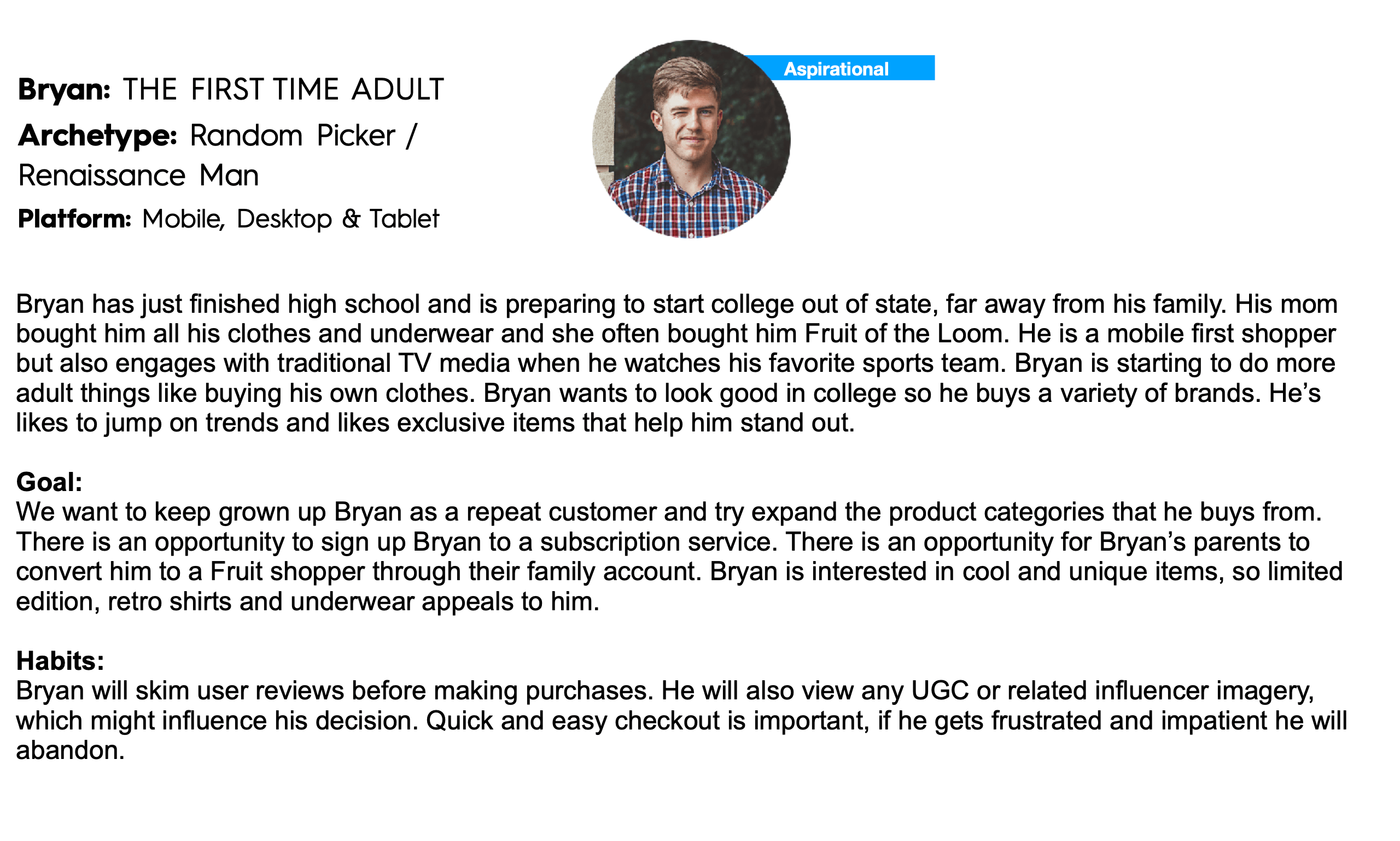
One of our aspirational customer personas.
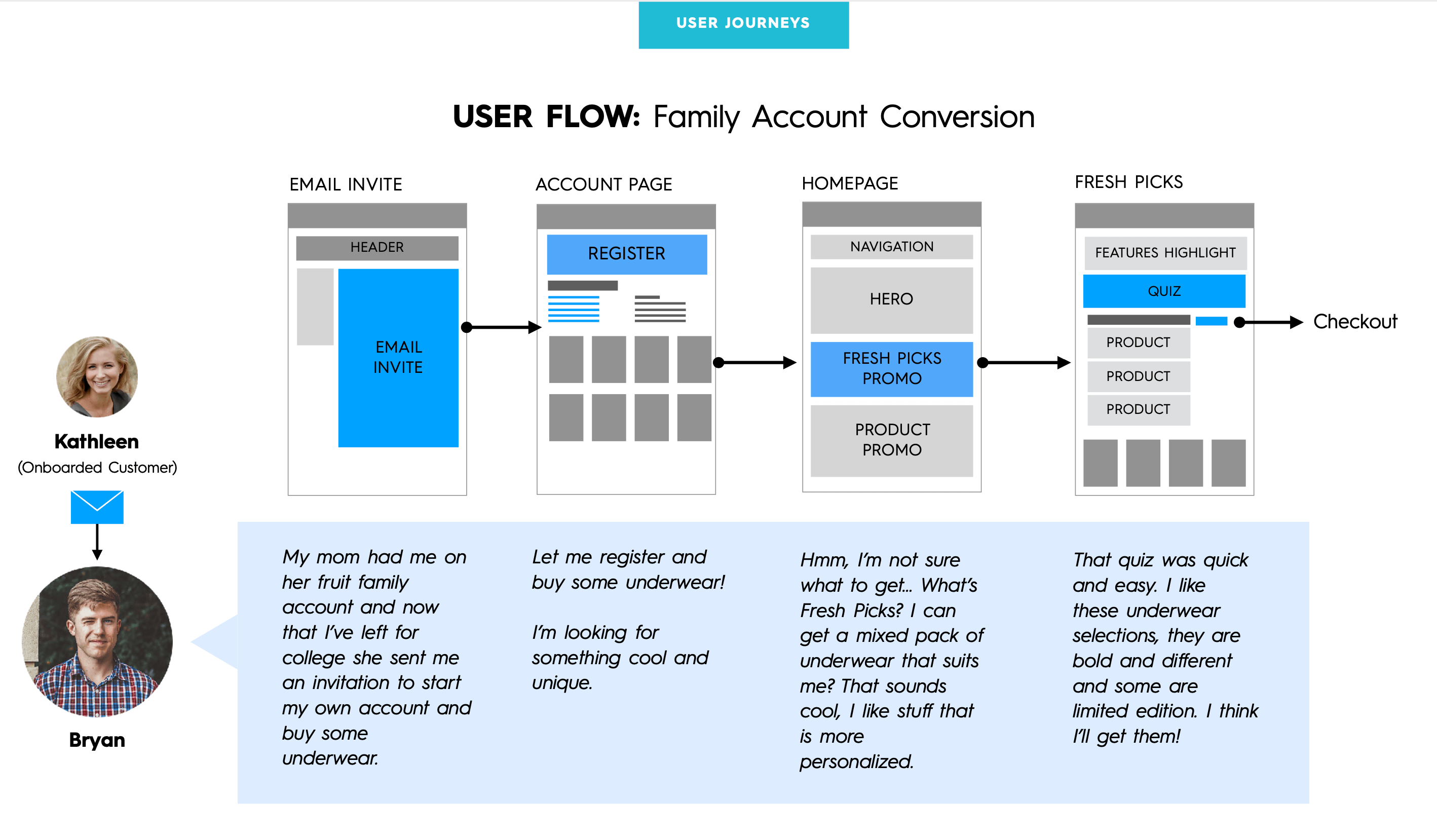
An aspirational 'to-be' customer journey.
Sketching
Our first sketching challenge was the site taxonomy. Fruit had many redundant and unfocused categories — I went through each one, documented every product, and created a refined category hierarchy. One key decision was merging 'Boys' and 'Girls' into a single category due to the limited product count in each.
From there, the team sketched early concepts for the major site sections before moving into wireframes.
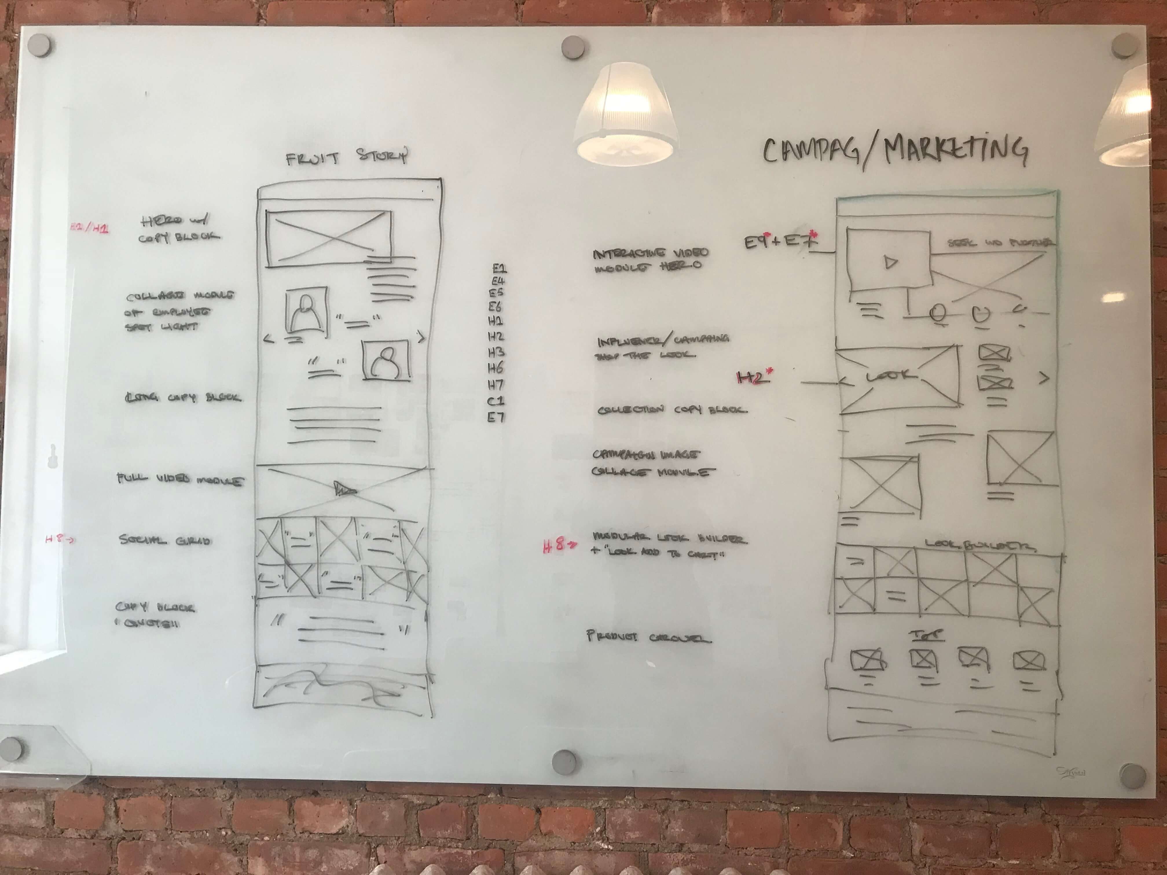
Early ideation and sketching sessions.
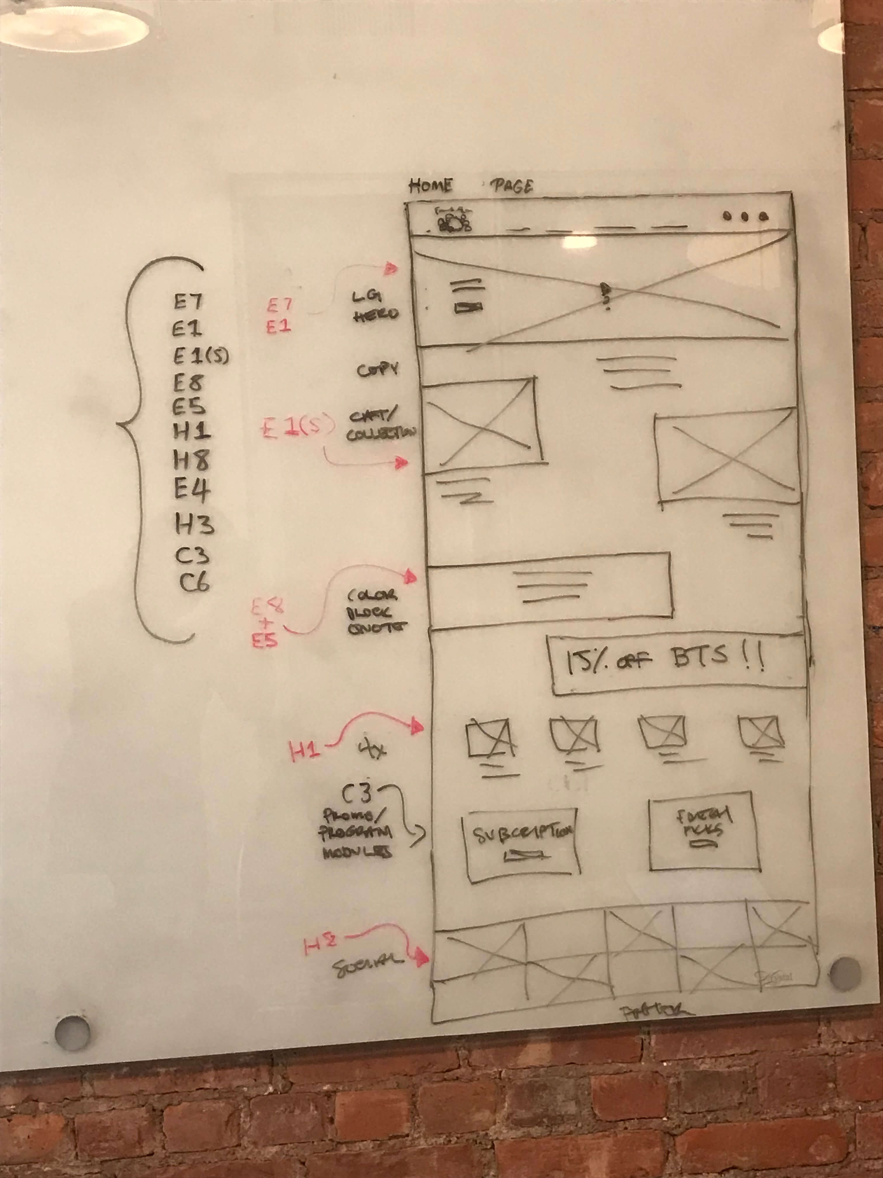
Further wireframe sketches.
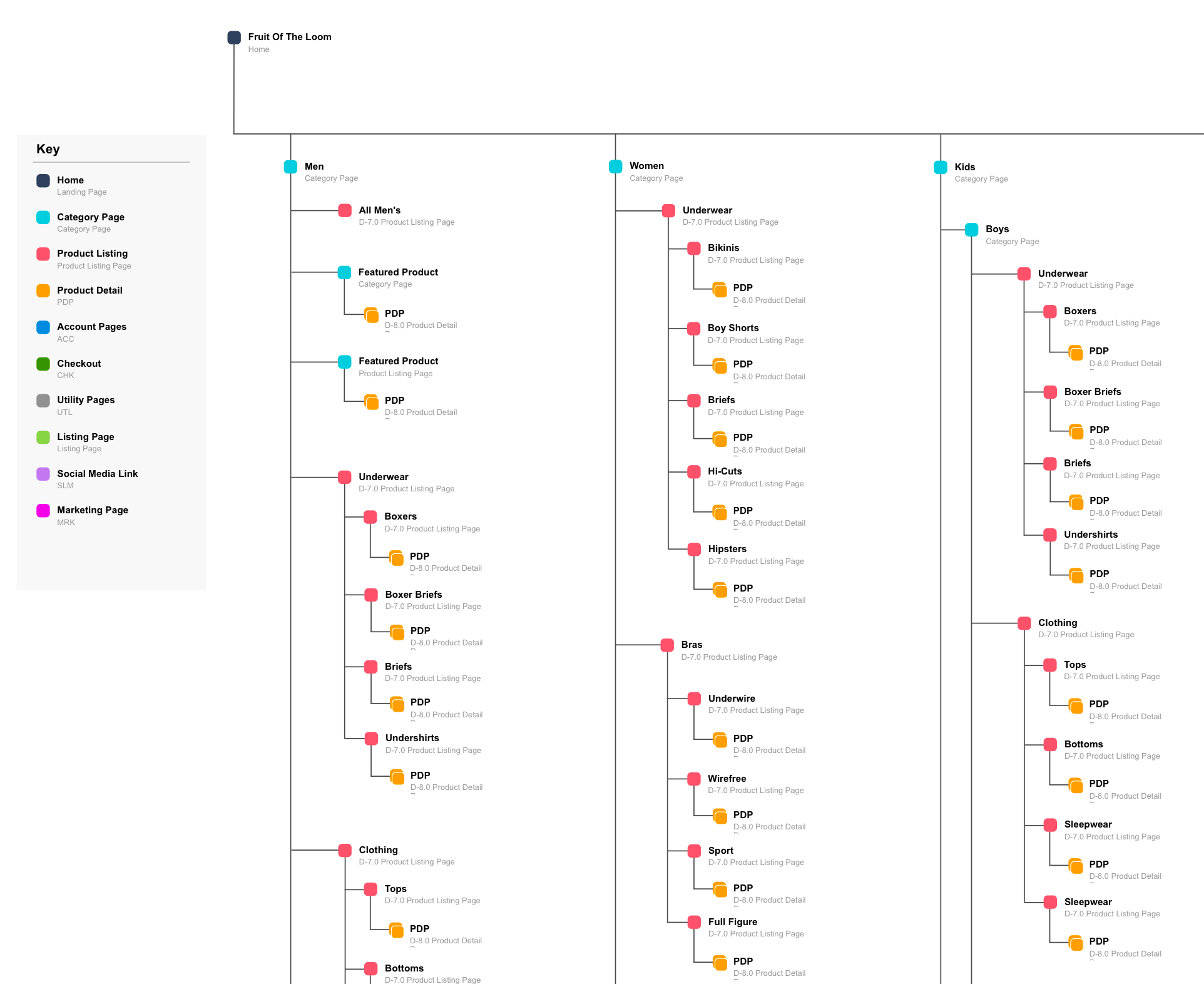
A close-up section of the improved site taxonomy.
Wireframing
The project was divided into 5 sprints of approximately two weeks each. After each sprint, wireframes were presented to the client before being handed to the visual designer.
Sprint 1 covered navigation dropdown menus and global elements — header, footer, and search. Sprint 2 focused on the product listing page and product detail page, improving the filtering system and adding a subscription option for recurring products like socks and underwear, alongside new content modules like a technology call-out and a 'shop the look' module.
Sprint 3 covered category landing pages and modular marketing pages — designed to be flexible enough for new product launches, campaigns, or brand storytelling. Sprint 4 tackled the homepage and a comprehensive sizing guide module — essential for a brand whose core product is apparel bought online. Sprint 5 was the cart and checkout, including a subscription management flow for users who opted into subscription boxes.
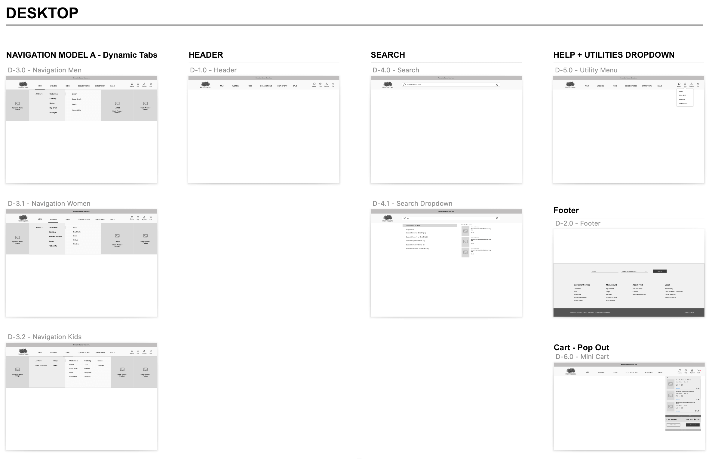
Selection of navigation wireframes from Sprint 1.
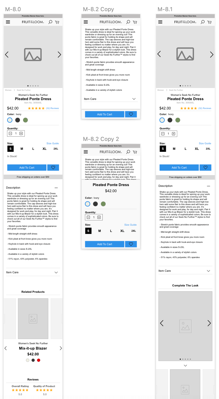
A portion of the mobile product detail page wireframes from Sprint 2.
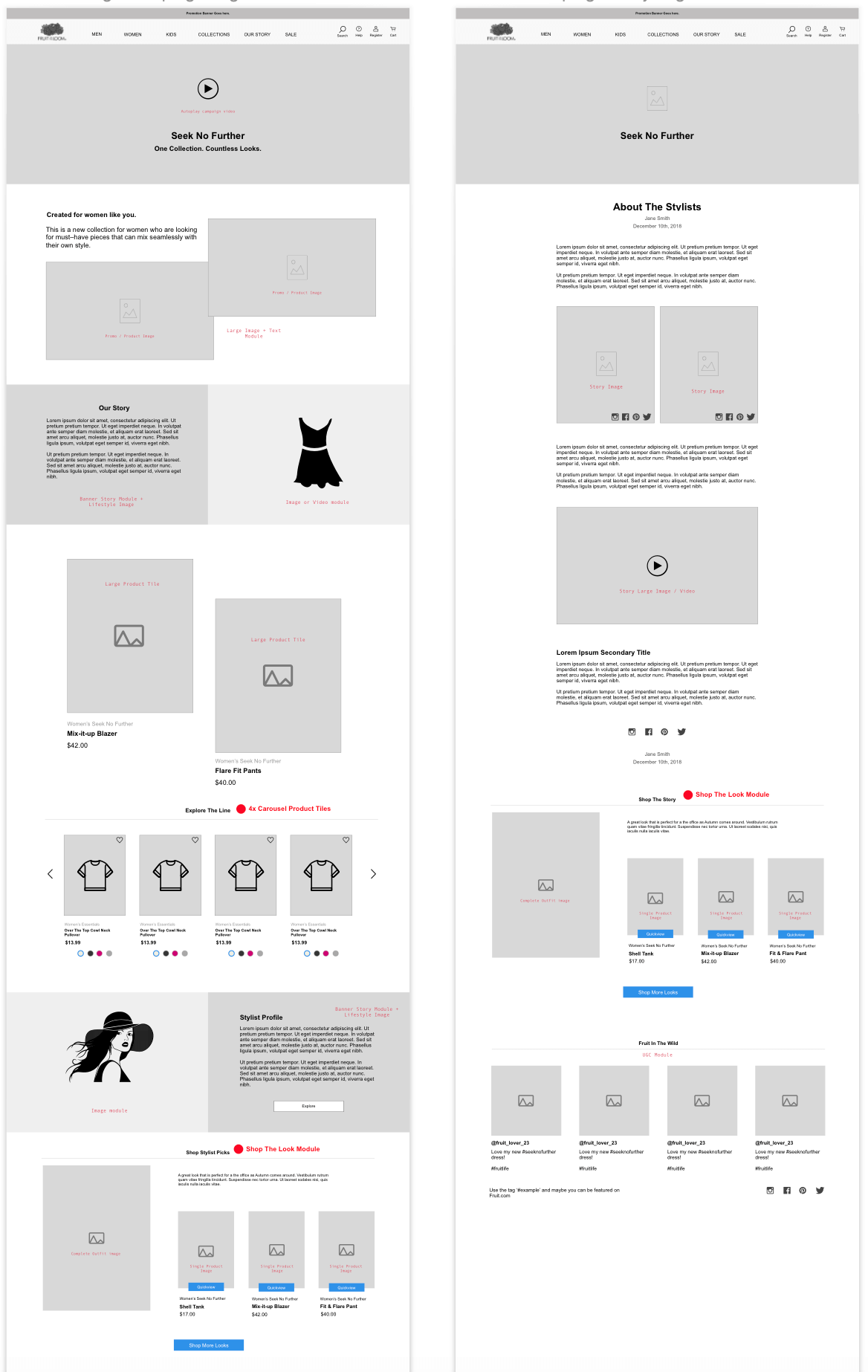
Wireframes of the modular marketing pages from Sprint 3.
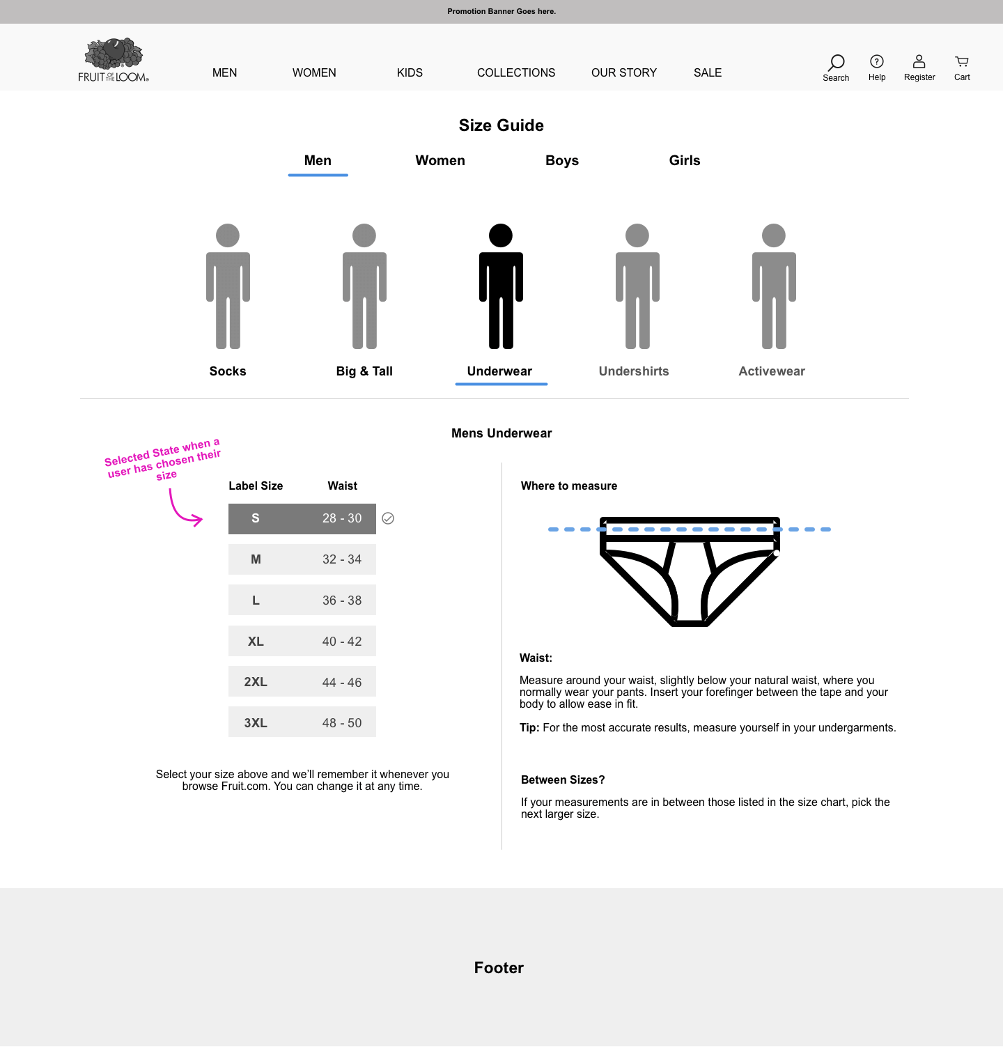
Closeup of the dynamic sizing module from Sprint 4.
Selection of checkout wireframes from Sprint 5.
Final Designs
After completing each sprint, conducting client reviews, and refining the designs, I sent completed wireframes to the visual designer. I provided UX support throughout as they brought the pages to life and created a whole new visual experience for the site. Once final designs were complete, I wrote technical annotations for each module and worked through implementation with the development team.
Final visual designs — homepage and key pages.
Final visual designs — product listing and category pages.
Final visual designs — mobile views.