Nespresso: Machine Assist
Designing a machine comparison page that guides customers to the right Nespresso machine for their needs — elegantly solving a complex filtering and comparison problem.
The Brief
The challenge was to create a comparison page for Nespresso's full range of coffee machines. Nespresso wanted a digital space where customers could view and compare all their machines in one place — at this point they had dozens, ranging from simple home brewers to complex barista-style machines.
Adding to the complexity, Nespresso had released a new type of coffee capsule that only worked in certain machines. It was essential to create a clear, guided experience that matched users to the right machine and funnelled them toward purchase.
Overview of the Nespresso Machine Assist project.
Ideation
During ideation we immediately ruled out a large product table — the last thing we wanted was users trawling through rows of specs searching for features. We wanted the experience to be simple and focused on the products most relevant to each individual.
Research told us customers had varied needs when buying a machine: cost, size, technology level, barista functionality. We designed a 'needs filter' that let users filter by these priorities — options like 'Sensible Cost', 'Compact Size', and 'Large Serving Size' — so they could quickly narrow down to what suited them.
Wireframing
I designed the needs filter with large icons and clear text labels to make the selection process fast and intuitive — prompting users to reflect on what kind of machine they actually wanted.
Below the filter, I designed a space to display machines from both capsule lines — 'Original' and 'Vertuo' — and let users select up to three to compare in a dynamic comparison chart. We limited to three to avoid overwhelming users with data and to keep the module workable on mobile.
The comparison chart was the most complex piece to design, especially on mobile. It needed to hold a lot of information: icons, specs, and product tiles. I created multiple variations and refined the layout based on team feedback until it felt digestible and informative.
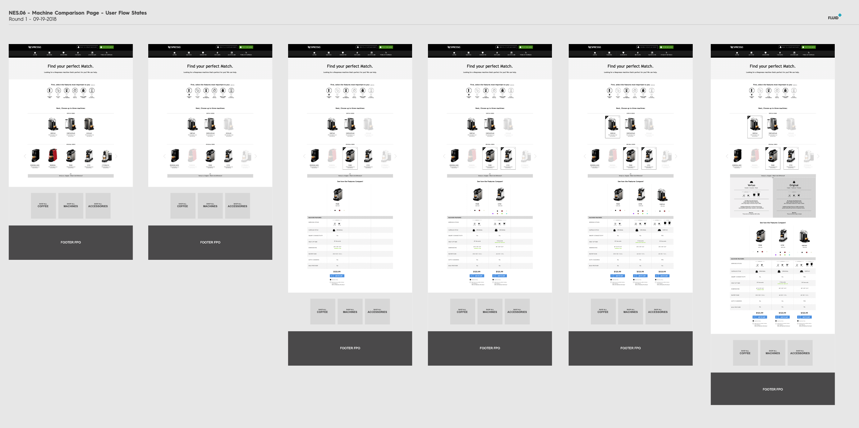
Overview of the desktop wireframes.
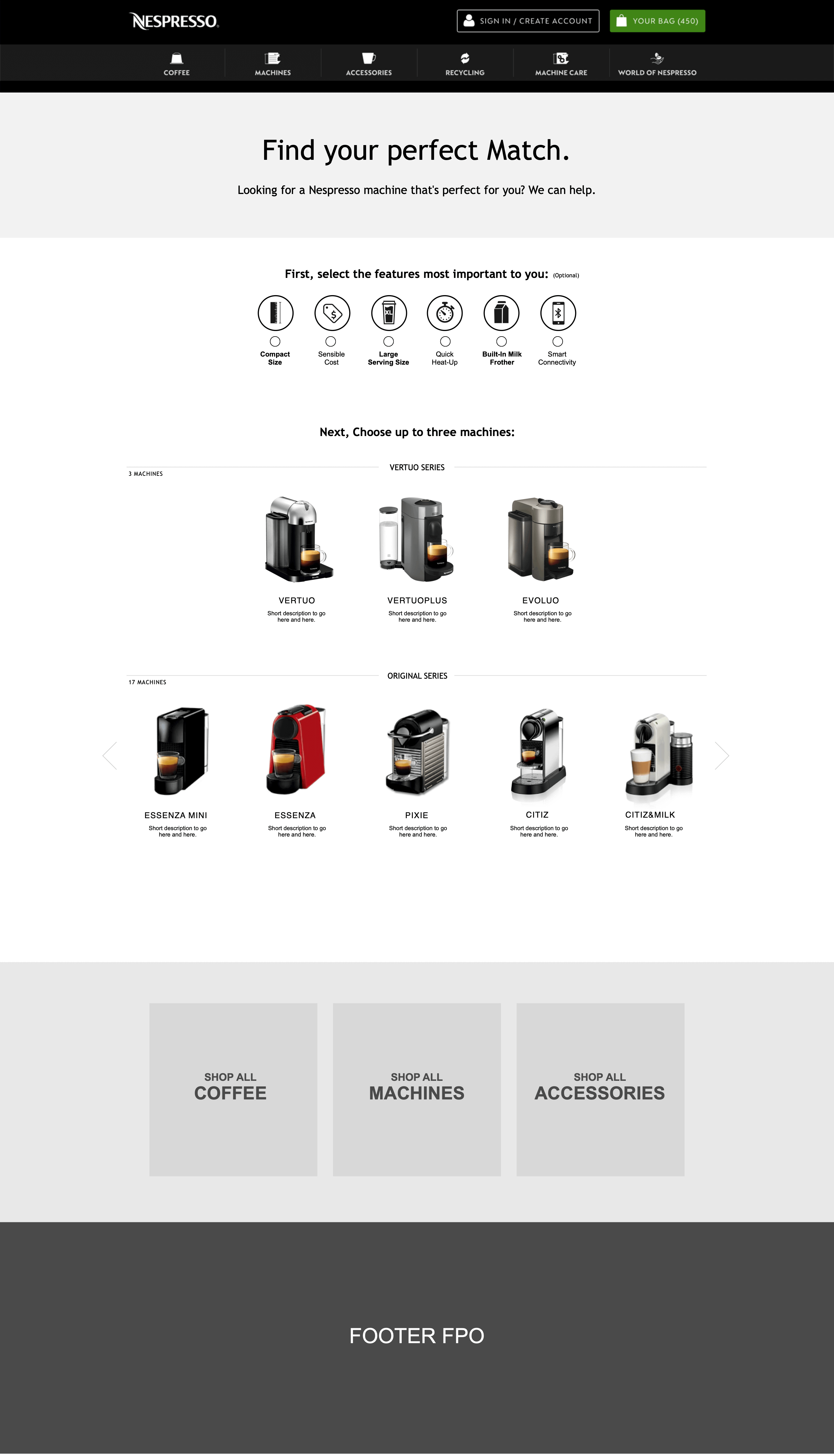
Full desktop wireframe — needs filter and comparison chart.
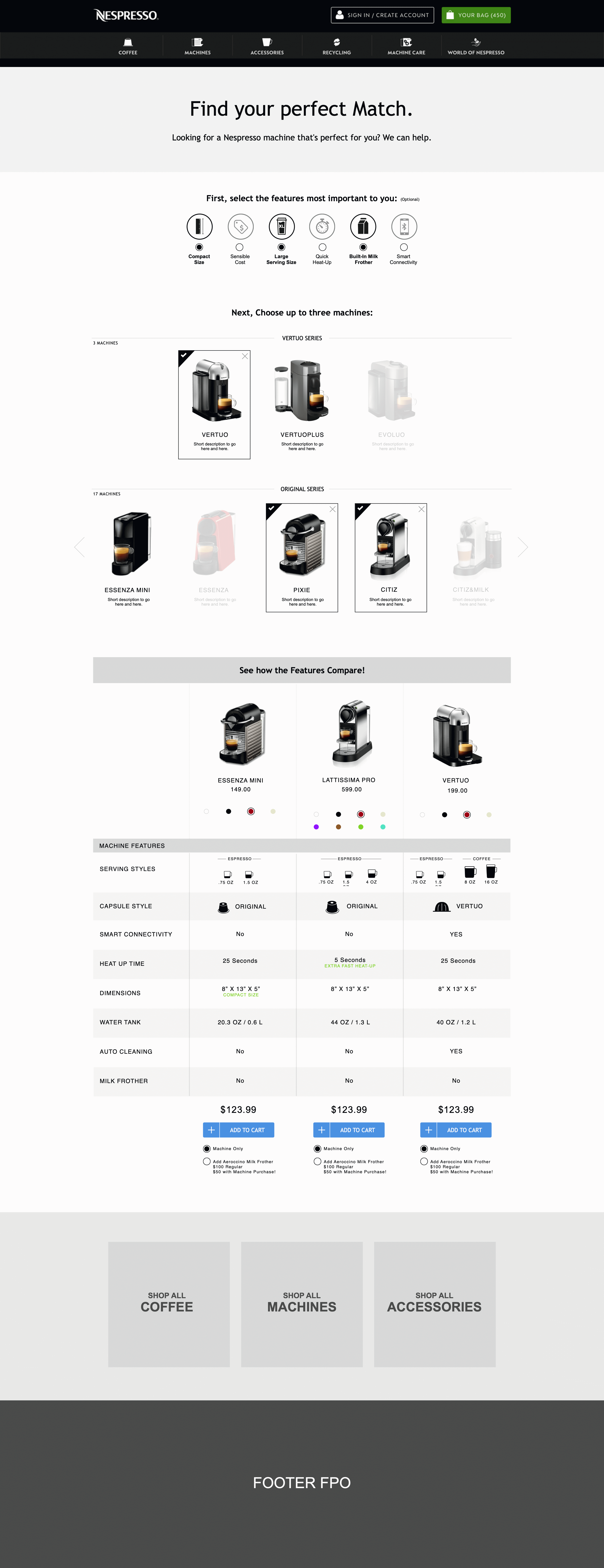
Full-page desktop wireframe showing all modules.
Mobile Wireframes
On mobile, the narrow width meant we had to choose between a side-scrolling comparison chart or limiting it to two columns. I wireframed and prototyped both approaches — testing confirmed a side-scroll was too cumbersome, so we limited mobile to two columns at a time.
To mitigate this constraint, I designed a sticky scrolling header allowing users to quickly swap machines in and out of the comparison. This kept the experience fluid even with the two-column limitation.
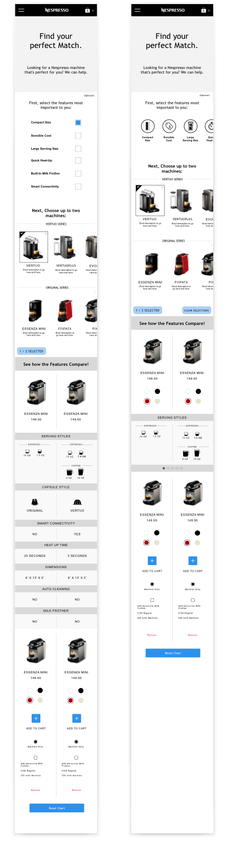
Mobile wireframes showing different filter layouts.
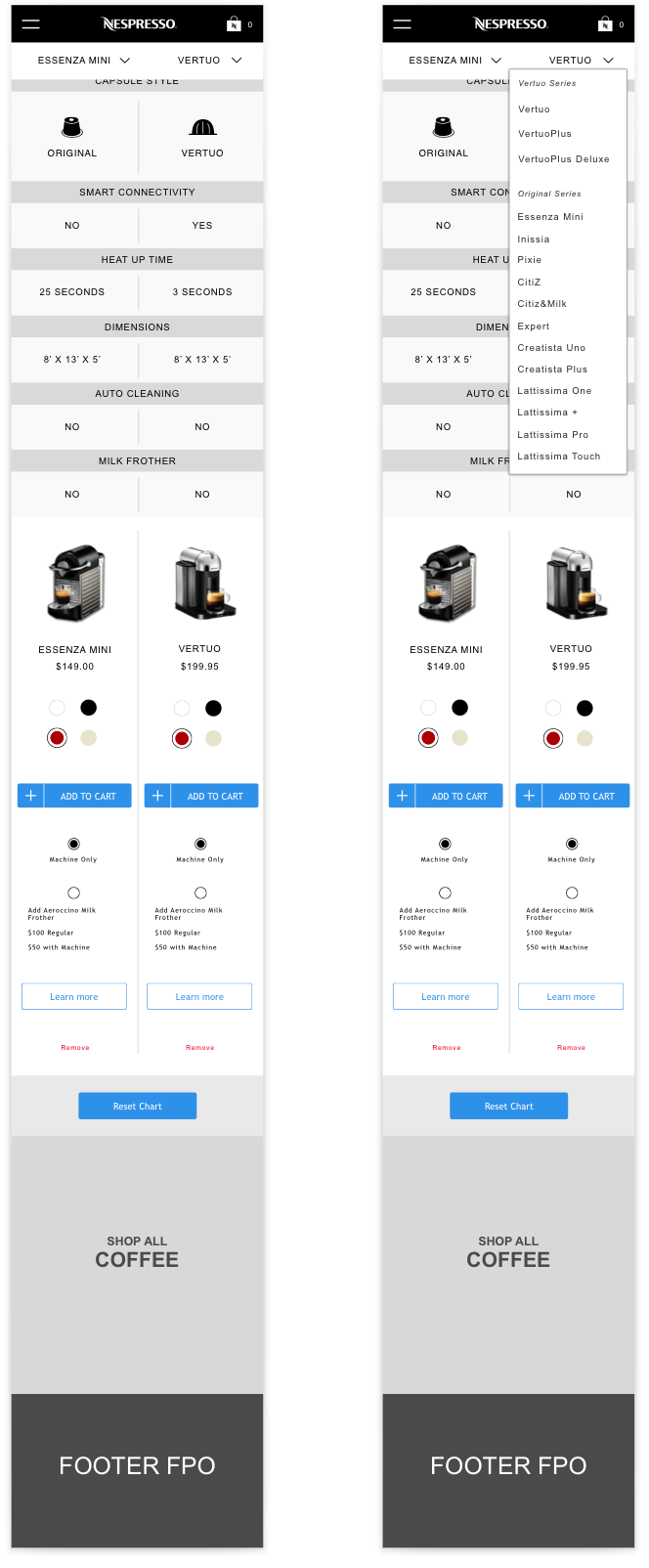
Mobile wireframe showing the sticky header and dropdown.

Mobile wireframe of the comparison module.
Final Designs
After wireframing and refinement rounds, I handed the designs to our visual designer who brought them to life using Nespresso's established style guide. I then annotated the designs and worked closely with the implementation team to ensure the complex comparison functionality worked as intended. Nespresso's feedback was extremely positive — the team had created an elegant, dynamic page that assisted users in finding their ideal machine without overwhelming them with jargon and technical specs.
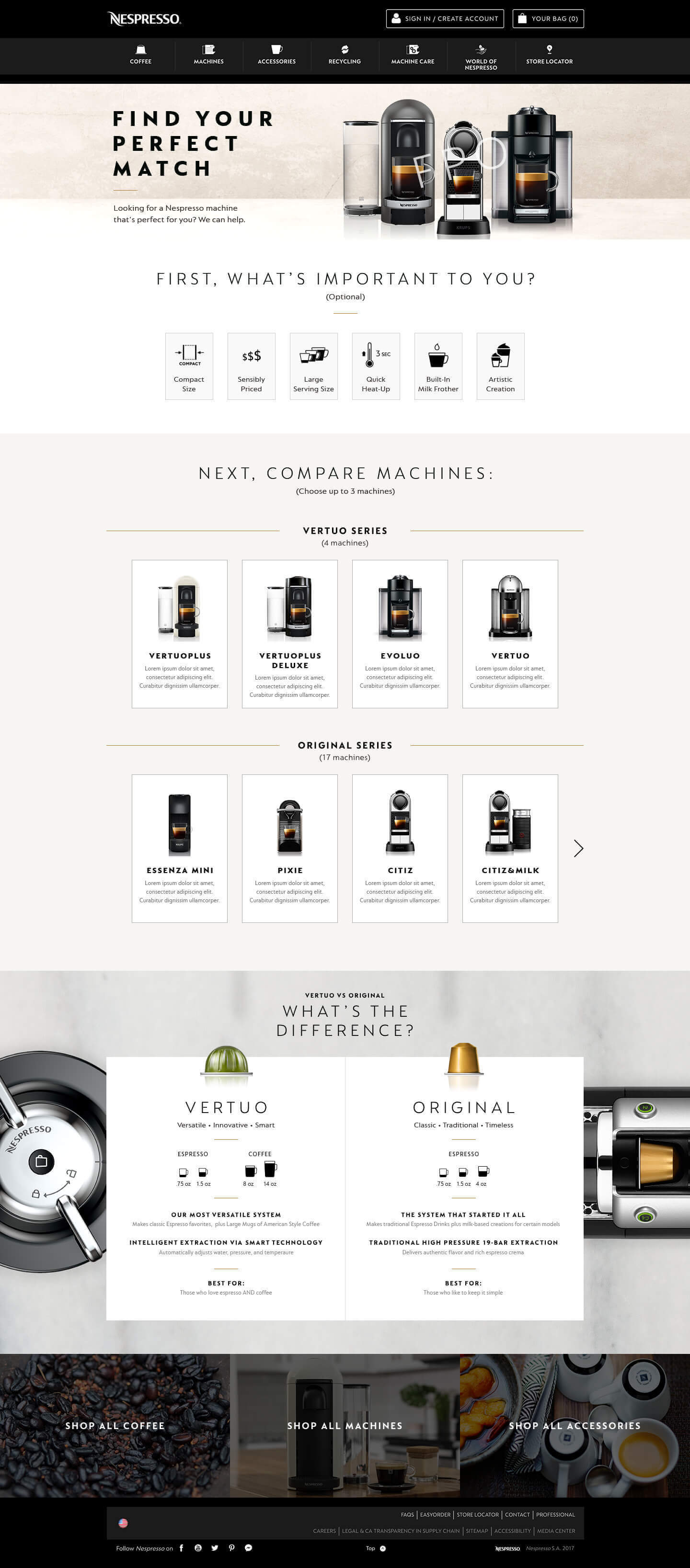
Final desktop visual design — needs filter and machine grid.
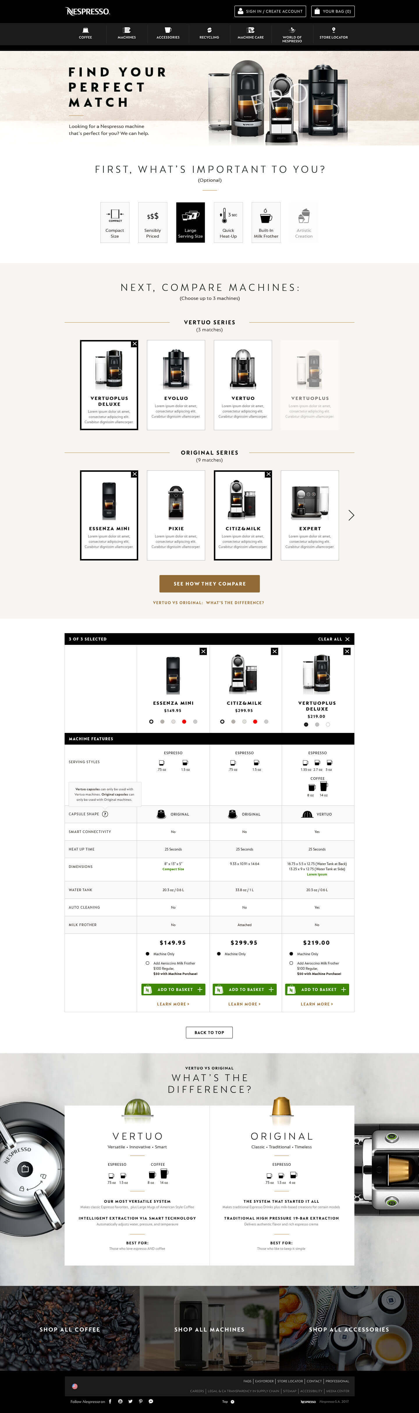
Final desktop visual design — comparison chart.

Final mobile visual design.