Weight Watchers Re-design
Redesigning the WW (Weight Watchers) eCommerce site to create a personalized, wellness-led shopping experience across global markets.
The Brief
WW (formerly Weight Watchers) had just completed a full brand redesign with a new focus on wellness. Our agency was tasked with redesigning the WW eCommerce site and creating a personalized, inspiring shopping experience. As WW is a global brand, the site needed to work internationally and across multiple regions.
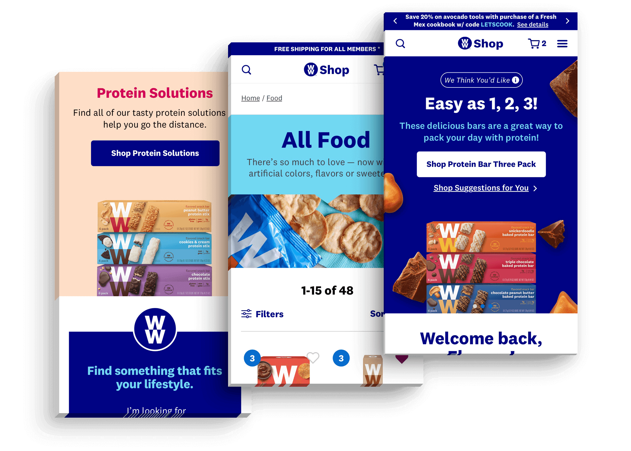
A selection of final visual designs from the project.
Conducting Research
Customers can buy products from the WW online shop, but the vast majority of their customers subscribe to the WW program. These users have a wide variety of goals — from healthy living to weight loss to overall wellness. To create a highly personalized shopping experience, we needed to deeply understand their needs.
I worked with our project strategist to interview users and gather research. We travelled to a WW studio in downtown Manhattan, sat in on a wellness session, and interviewed studio members afterwards.
We found that different WW members have very different needs — many buying only specific food types for specific uses. Their needs were highly personalized: some required high protein or gluten-free food, others needed products for specific occasions like office snacks or gym workouts. This insight led us to create a 'solution-oriented' shopping experience.
We also ran additional research using web analytics and WW's own user research documents. Together, we developed three user personas and four user need states.
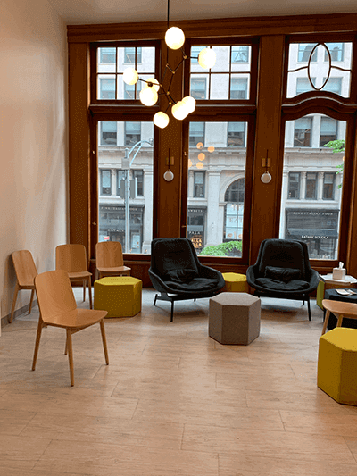
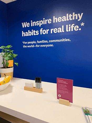
Visiting a WW member studio in Manhattan.
Observing a WW wellness session.
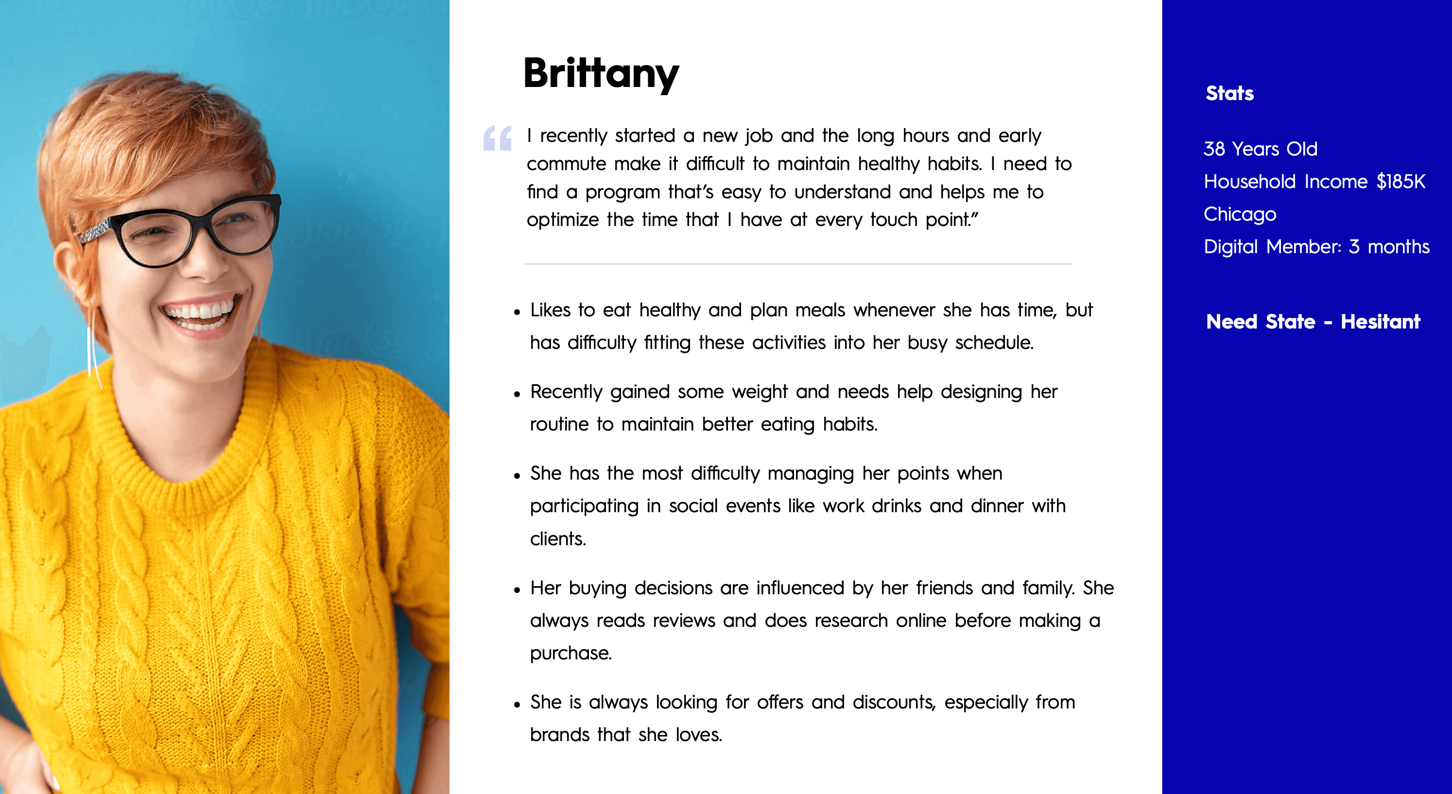
One of three user personas developed from our research.
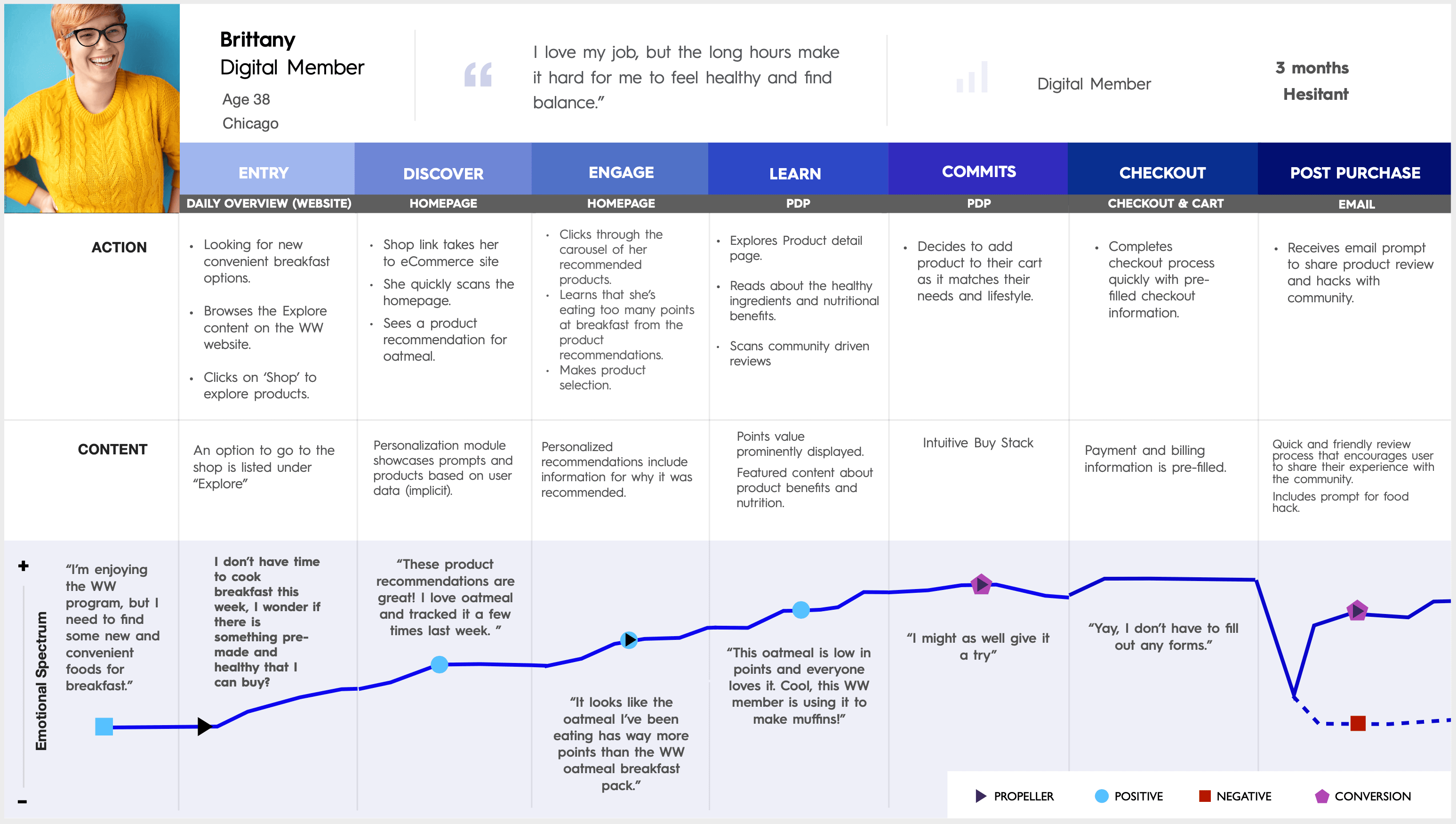
A user flow created during the research phase.
Sketching & Wireframing
Once research concluded we moved into sketching and wireframing, breaking the project into four major sprints — each covering two key site sections.
- Sprint 1: Navigation, taxonomy, and the product page.
- Sprint 2: Cart, checkout, and product listing page.
- Sprint 3: Homepage and landing page.
- Sprint 4: Category page, guided selling, and personalization modules.
We designed the site for three main user types: guest users, users with store accounts, and full WW members — rethinking each page to surface the most relevant modules and content per user.
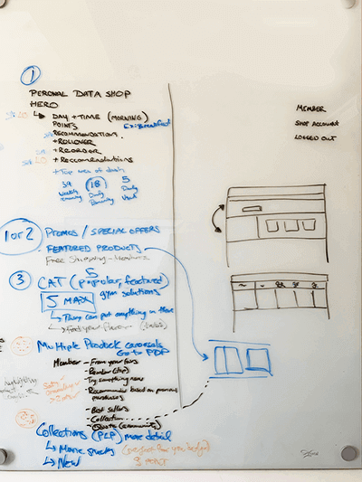
Sprint 1 used analytical data to sketch the site taxonomy and navigation. We opted to let users shop by product type and by product solution — allowing them to find a specific product or discover one that fits their lifestyle. I wireframed the product page as a modular layout with an in-depth ingredients module and a personalized 'Why you'll love this' section.
Sprint 2 was the most technically demanding — the cart and checkout contained multiple flows with many page states, covering guest and logged-in users both on mobile and desktop.
The main challenge of Sprint 3 was the homepage. I wireframed three variations — one per user type — each prioritising different modules. The member version featured a personalized 'Just for you' module high on the page for efficient reordering. The guest version focused on introducing the WW program using promotional and guided selling modules.
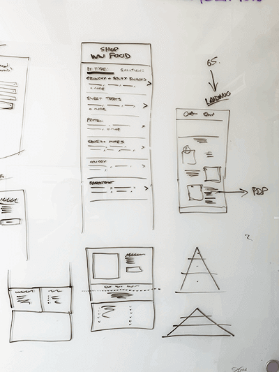
Sketching the navigation during Sprint 1.
Further navigation and layout sketching.
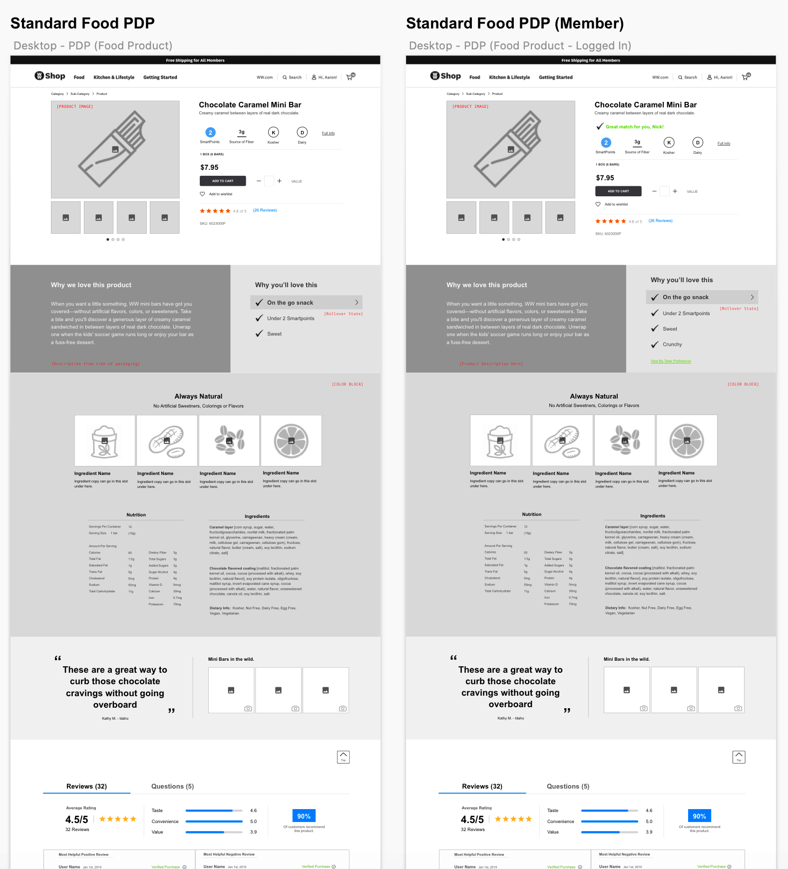
A section of the desktop product detail page wireframe from Sprint 1.
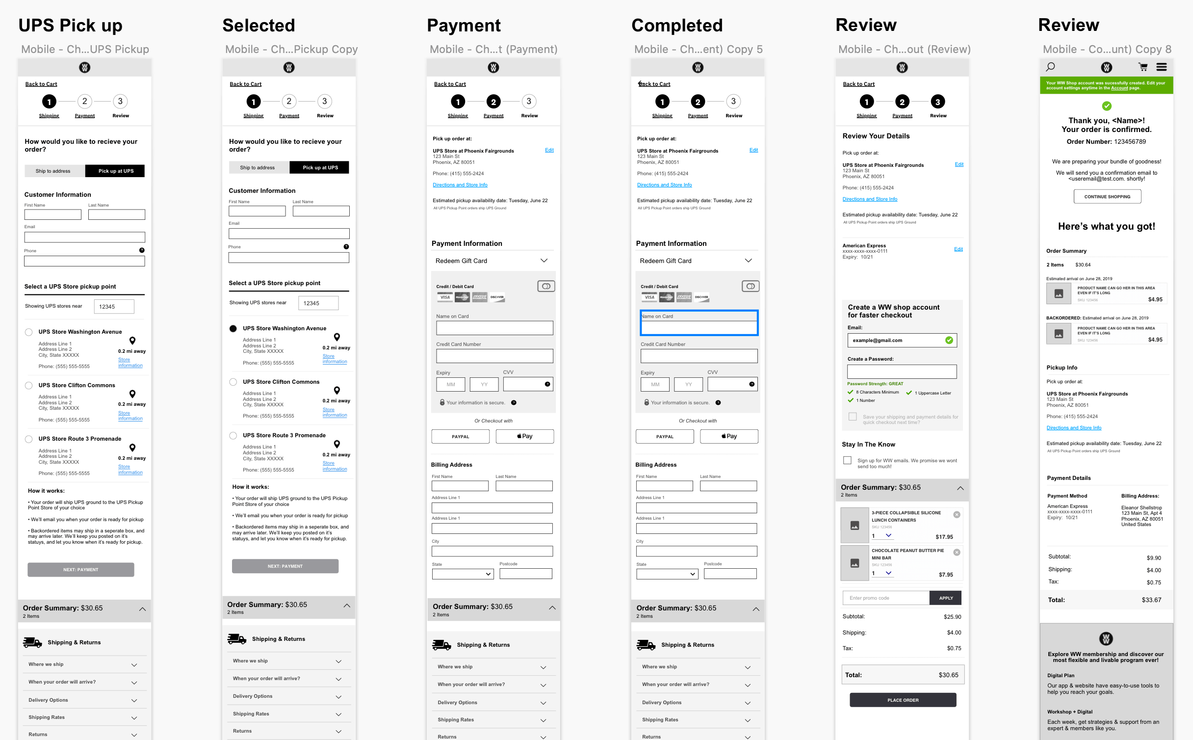
Part of the mobile checkout wireframes from Sprint 2.
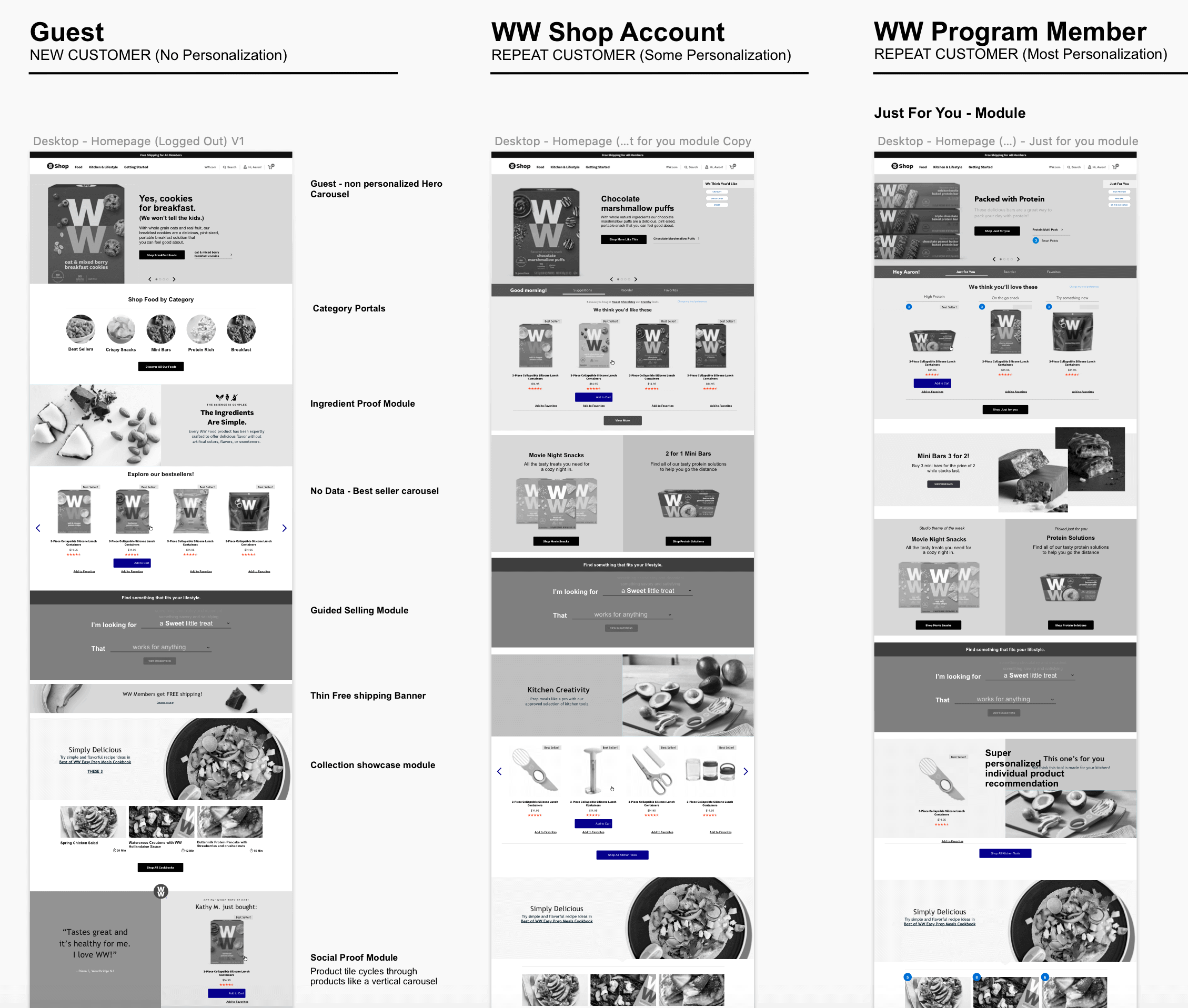
Variations of the homepage showing different module layouts per user type.
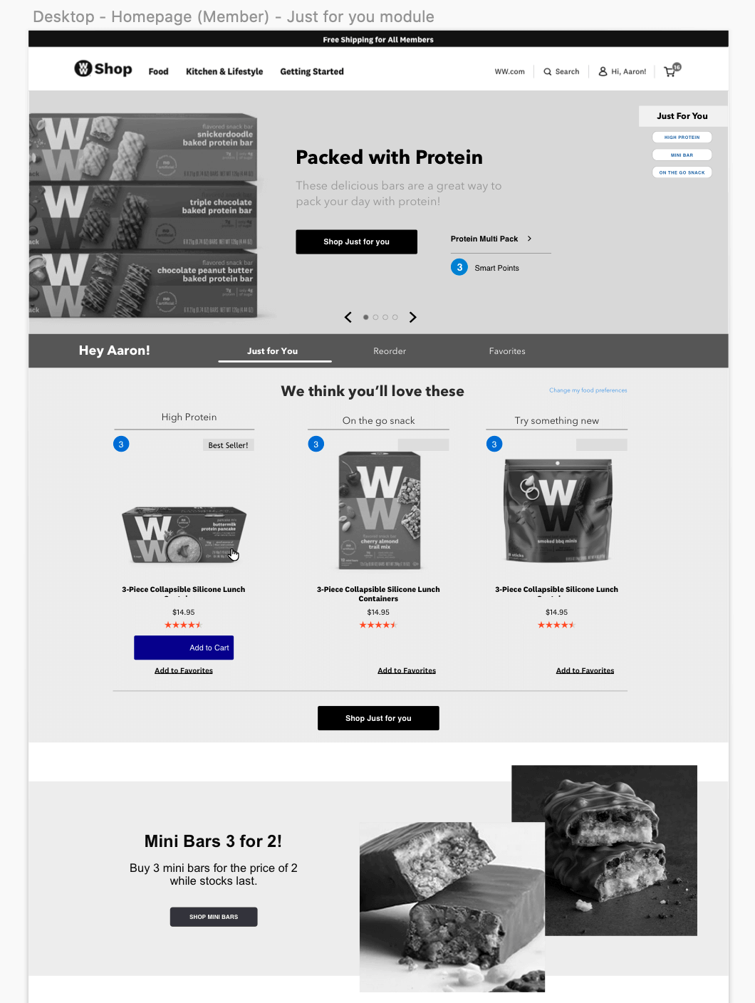
Detail of the 'Just for you' personalization module on the member homepage.
Personalization & Guided Selling
Sprint 4 focused on fleshing out the personalization and guided selling modules. Throughout previous sprints we ideated on a 'tagging' system, where each product could be tagged based on its attributes and the solutions it works for — for example: salty, high protein, post-workout snack, great on-the-go.
I also designed an interactive, natural language guided selling module that guides users to products matching their tastes and lifestyle by asking a series of questions. The module was highly interactive, so I prototyped it in UXPin and tested it with users, using their feedback to refine it further.
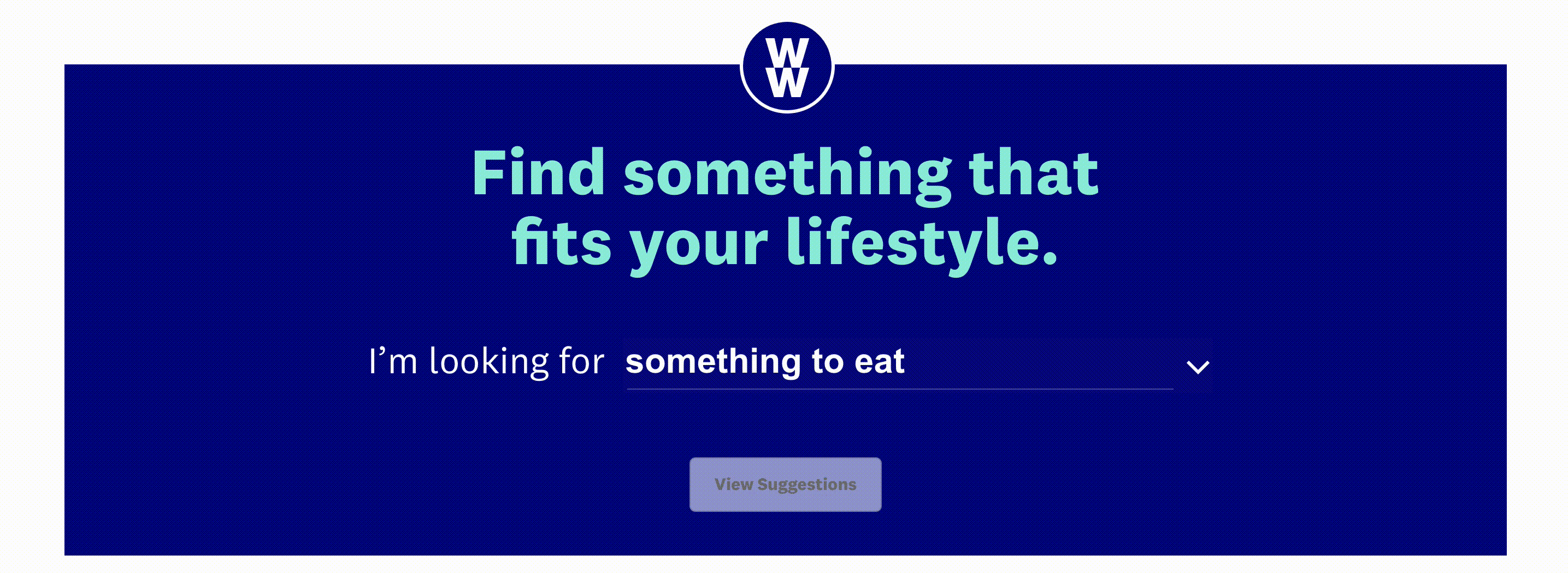
The natural language guided selling module interactive prototype.
Final Designs
At the end of each sprint, after user testing and refinements, I handed wireframes to our visual designer who expanded upon the WW style guide to bring each page to life. Once complete, I annotated every module for the development team and worked through multiple QA sessions to ready the designs for implementation. The feedback from the WW team was overwhelmingly positive.
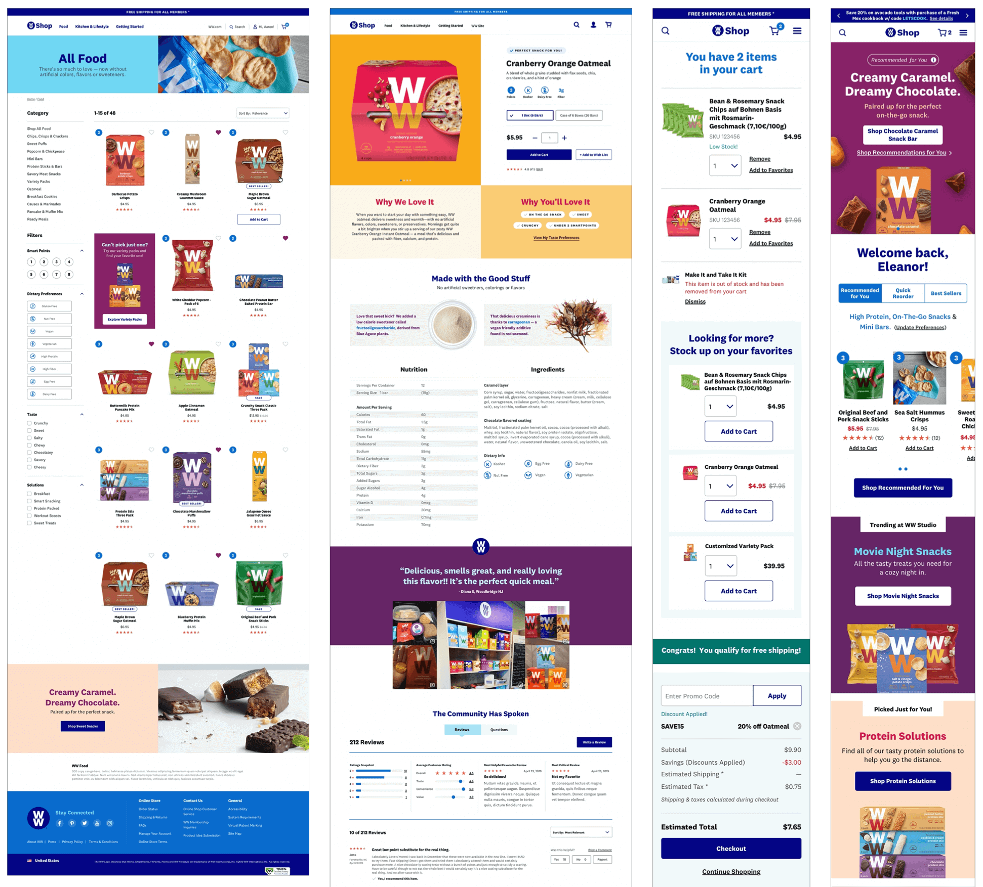
A selection of final visual designs brought to life by our Sr. Visual Designer.